Angle
House
Angle House
Project informationPERIOD
2019-2022TYPE
RESIDENTIAL, VILLALOCATION
THE NETHERLANDSSIZE
390m2STATUS
COMPLETED
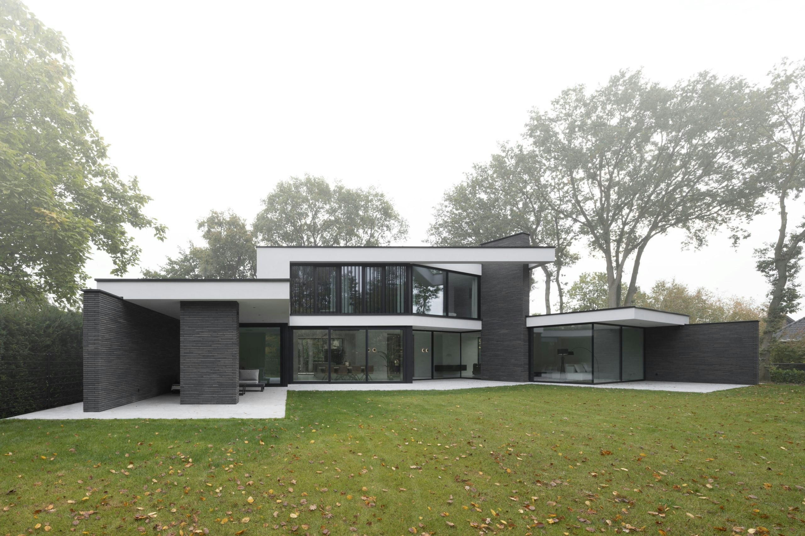
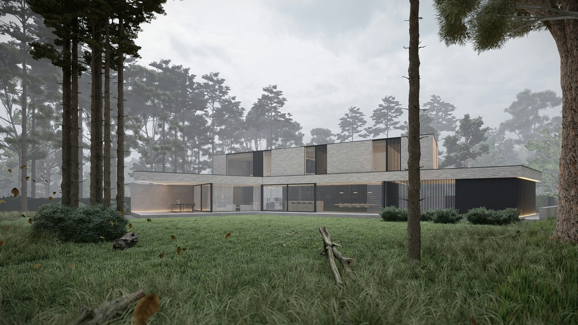
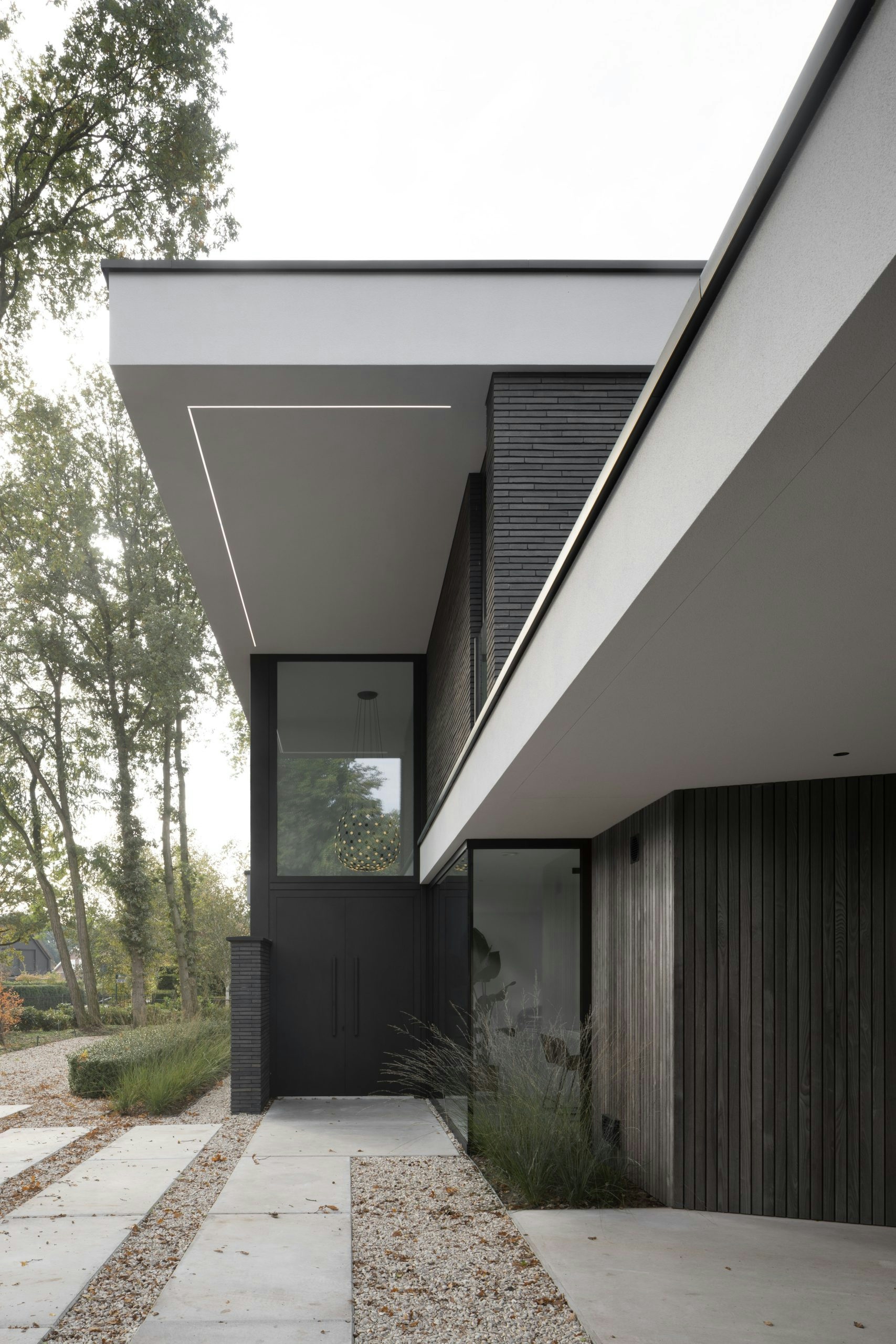
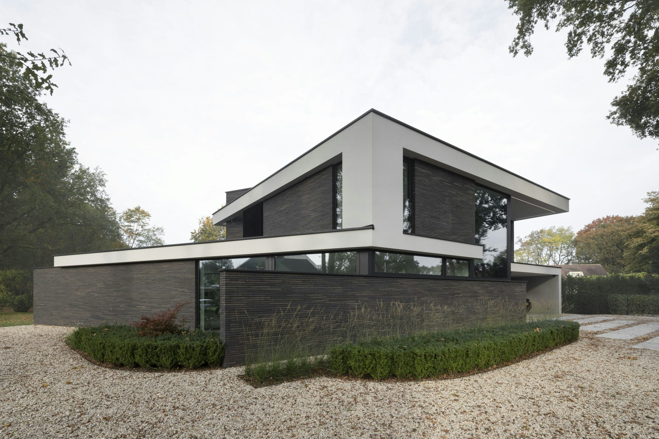
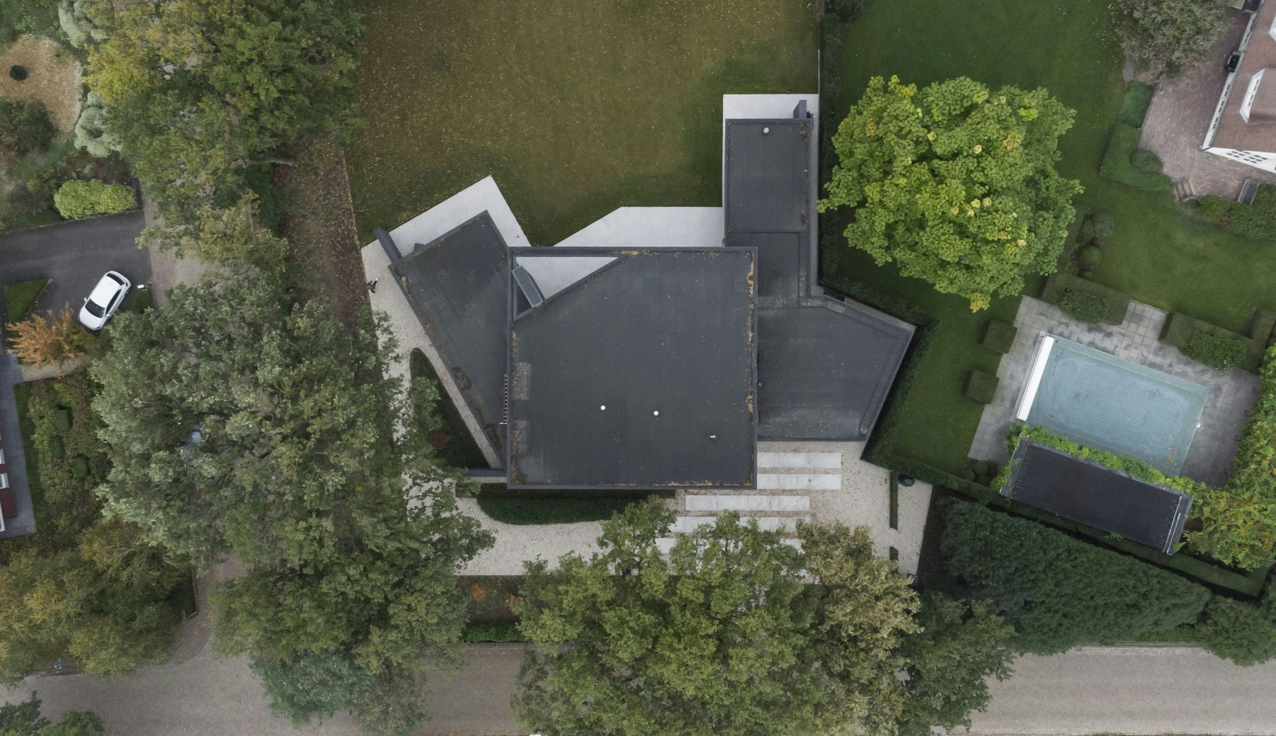
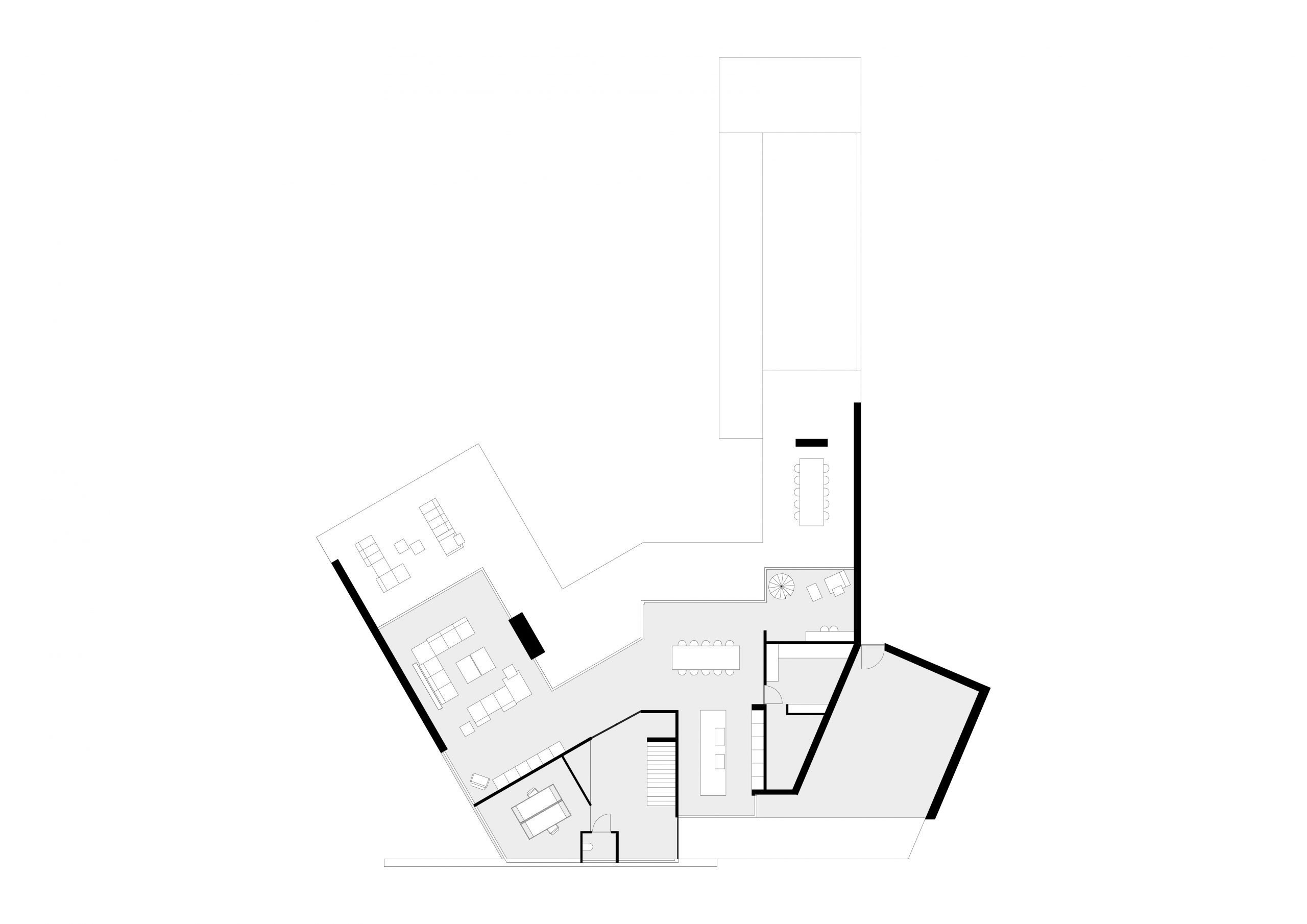
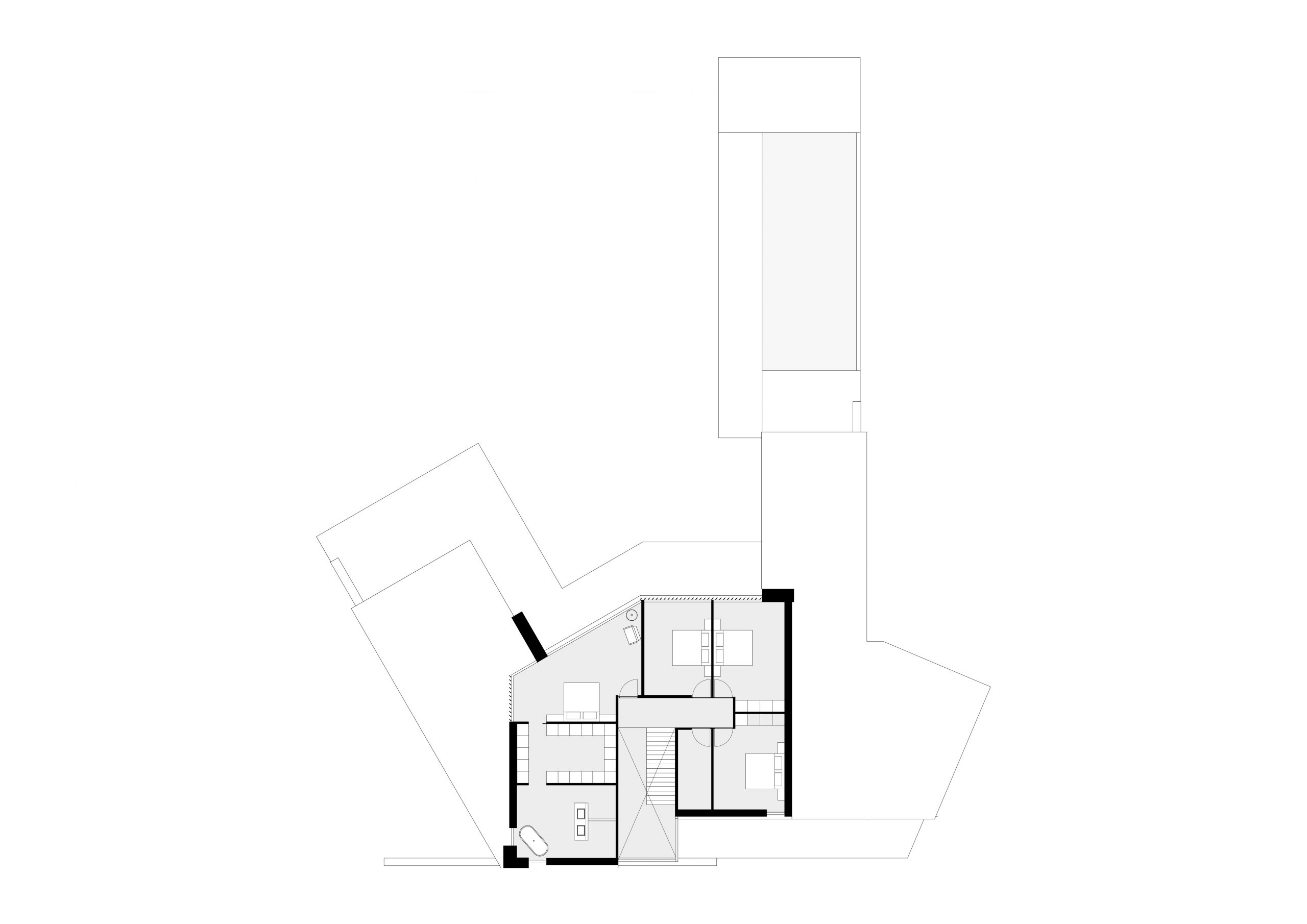
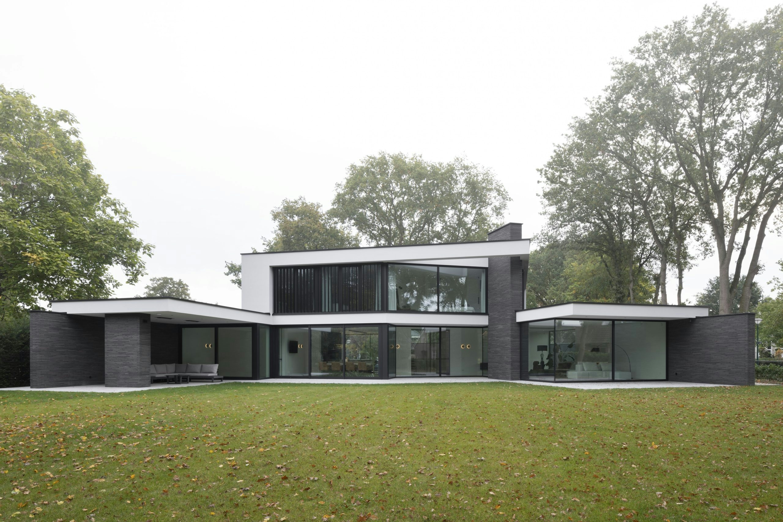
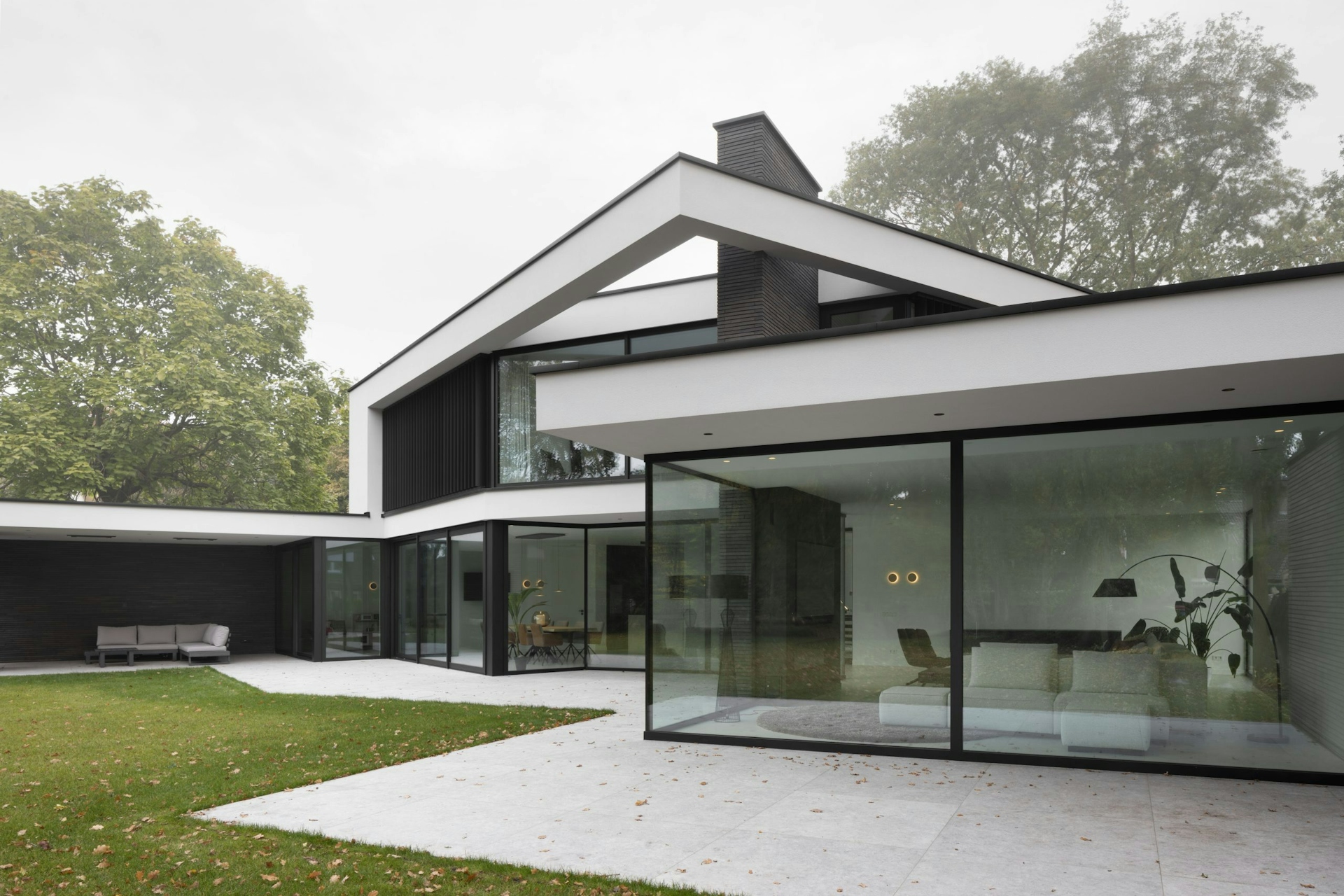
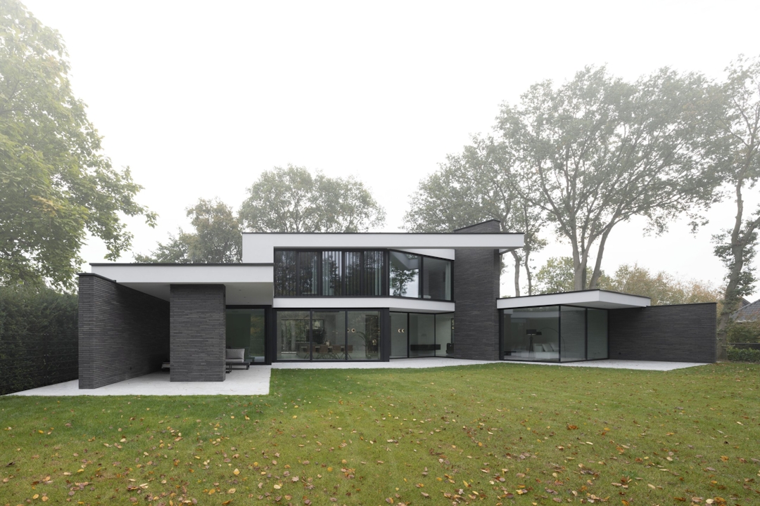
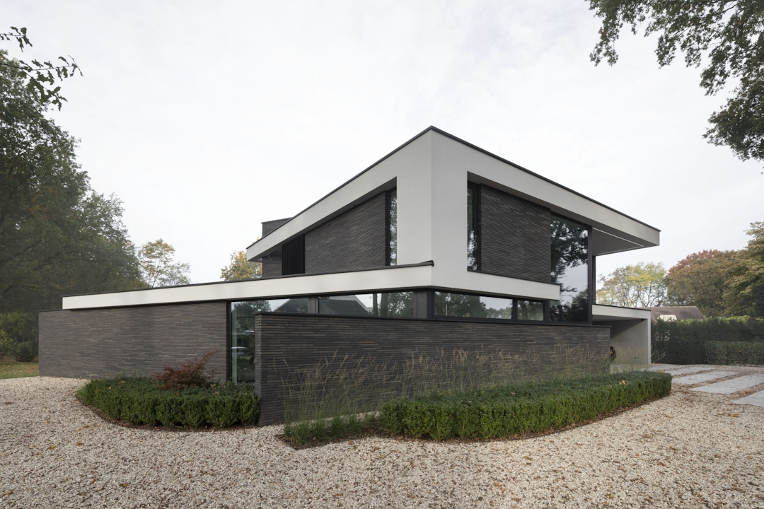
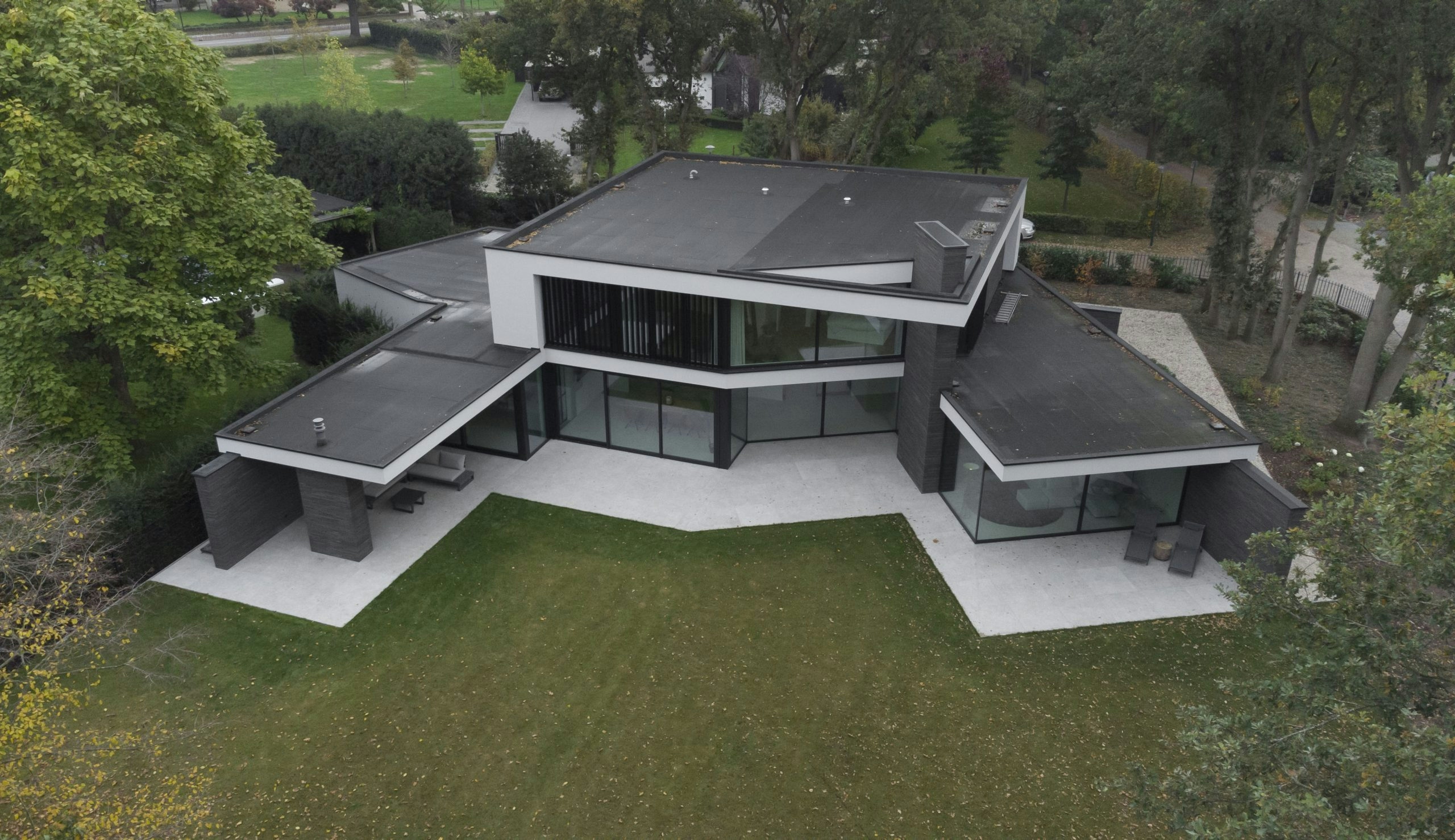
With angle house, the main idea was to use the plot to its fullest advantage. By placing the main volume close to the road, a large back garden was created. On either side of the main volume, two sub-volumes are situated, angled outwards. This is done to open up the design to the plot, embracing it fully.
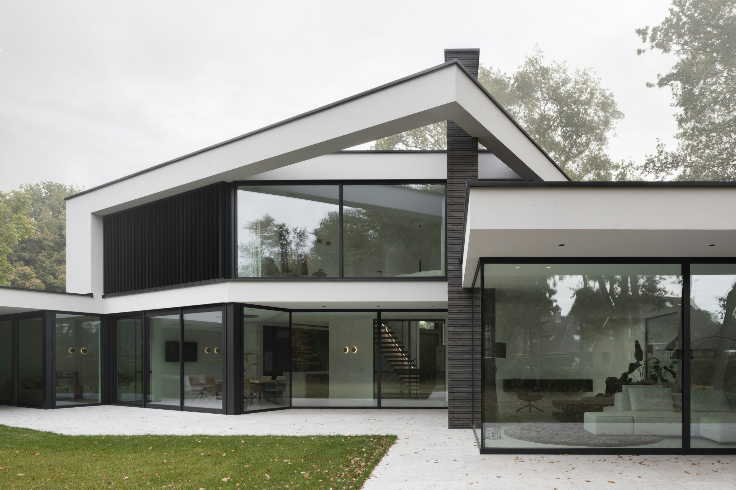
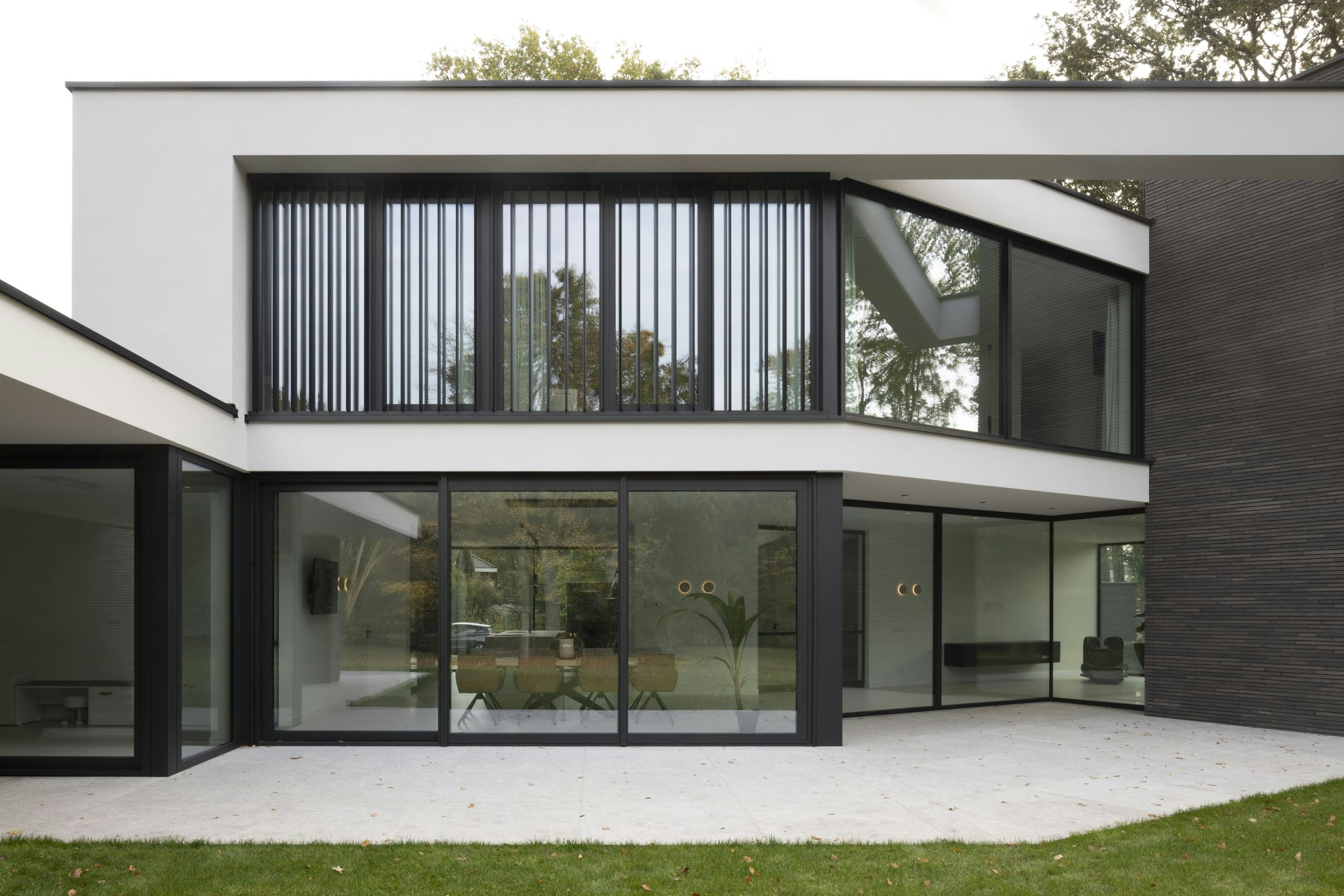
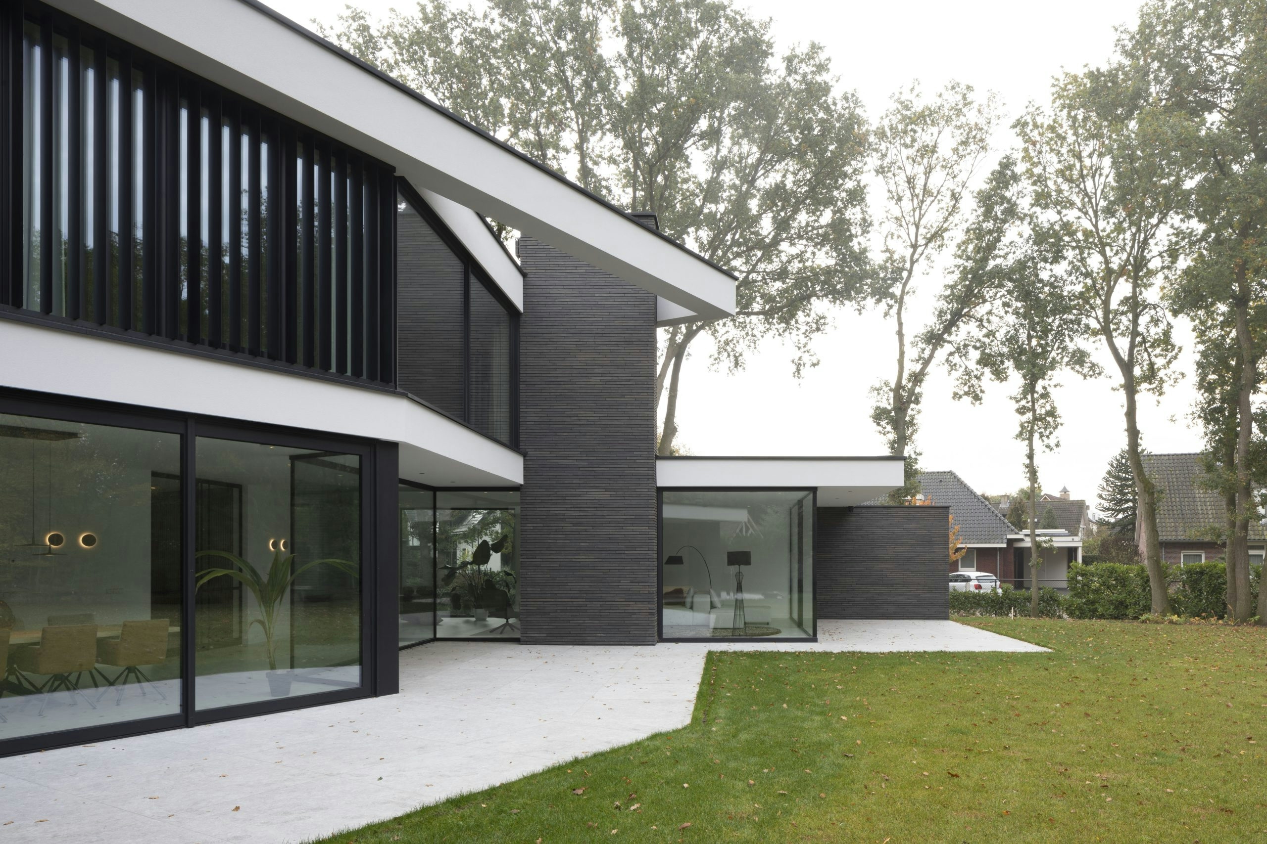
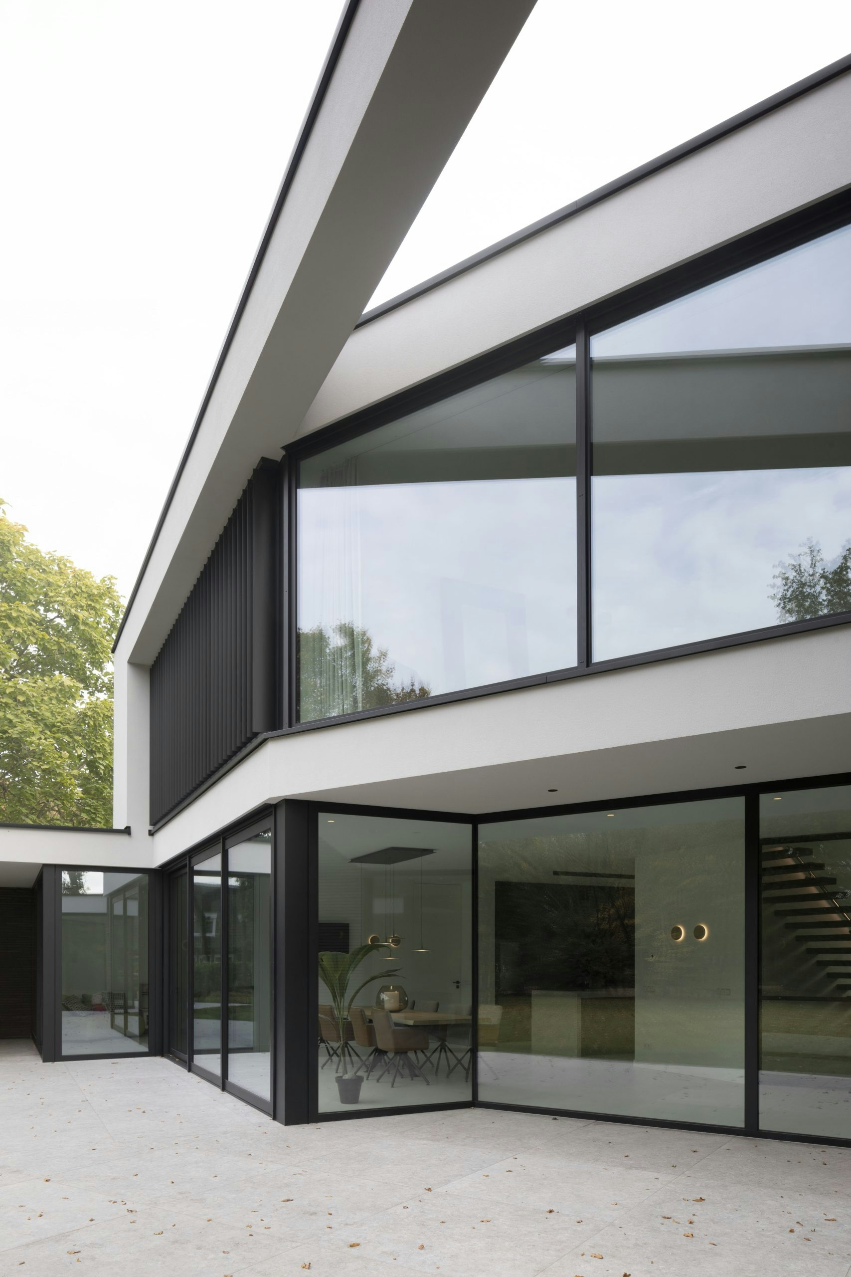
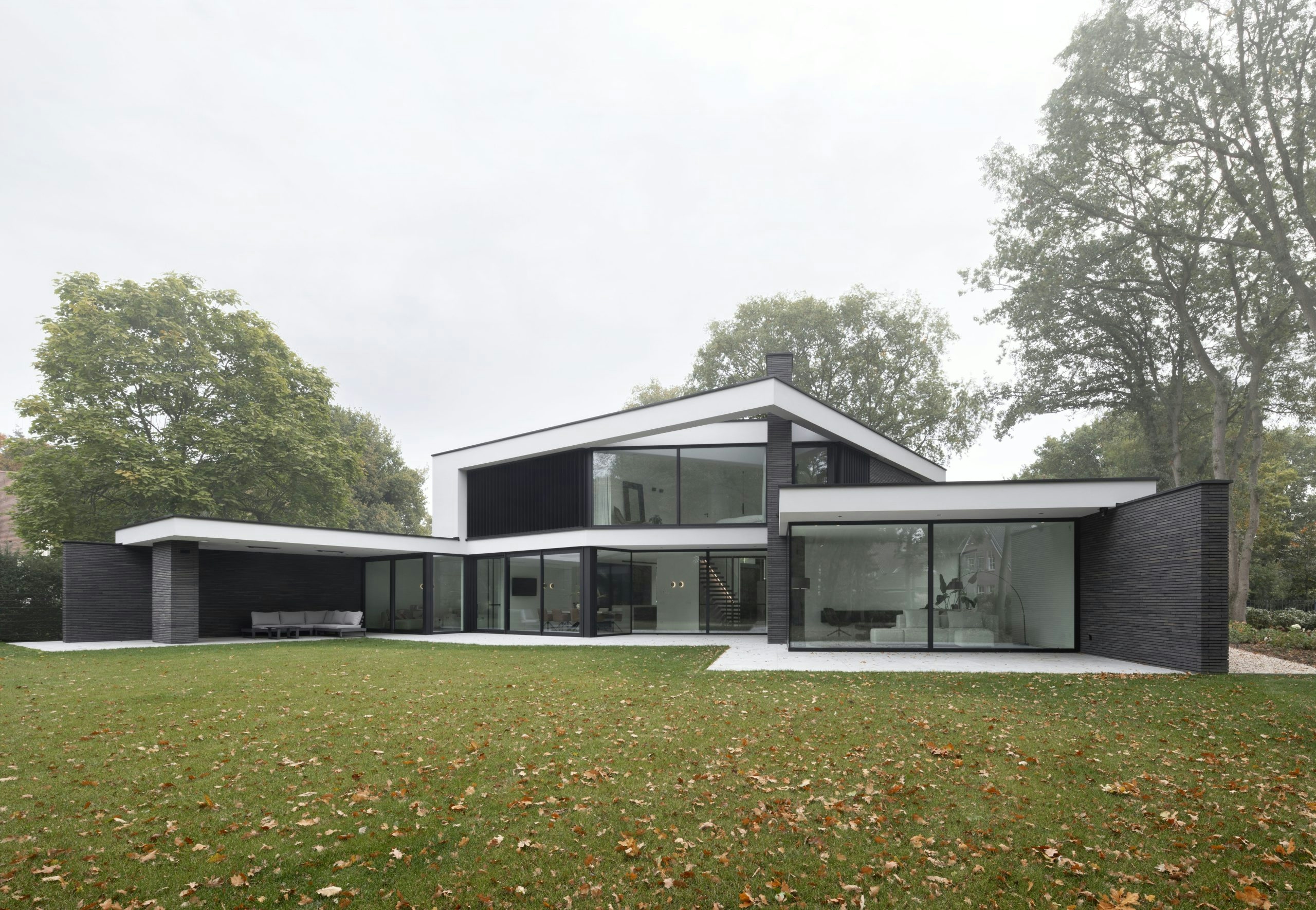
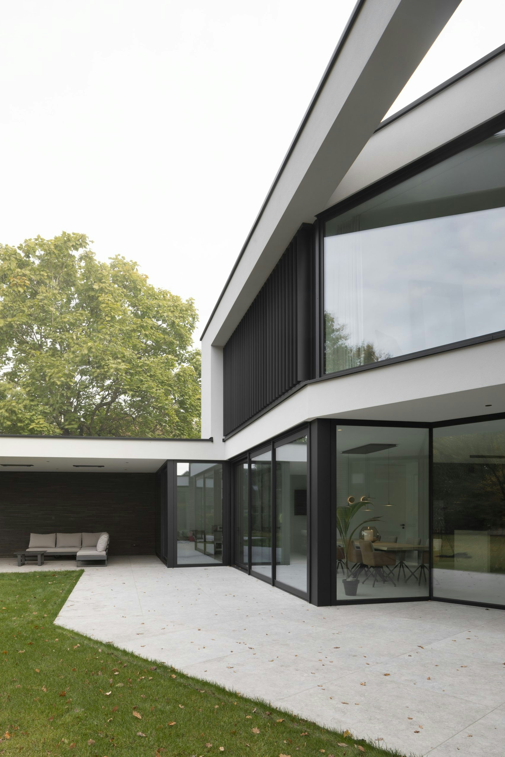
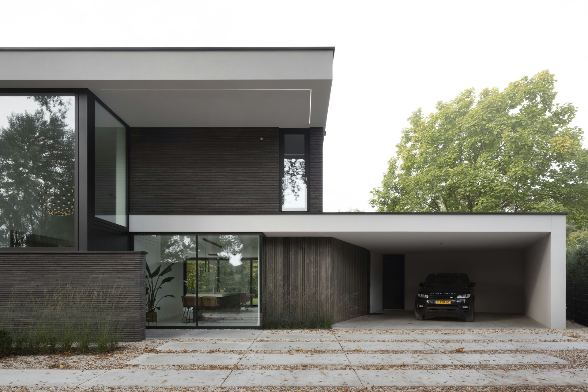
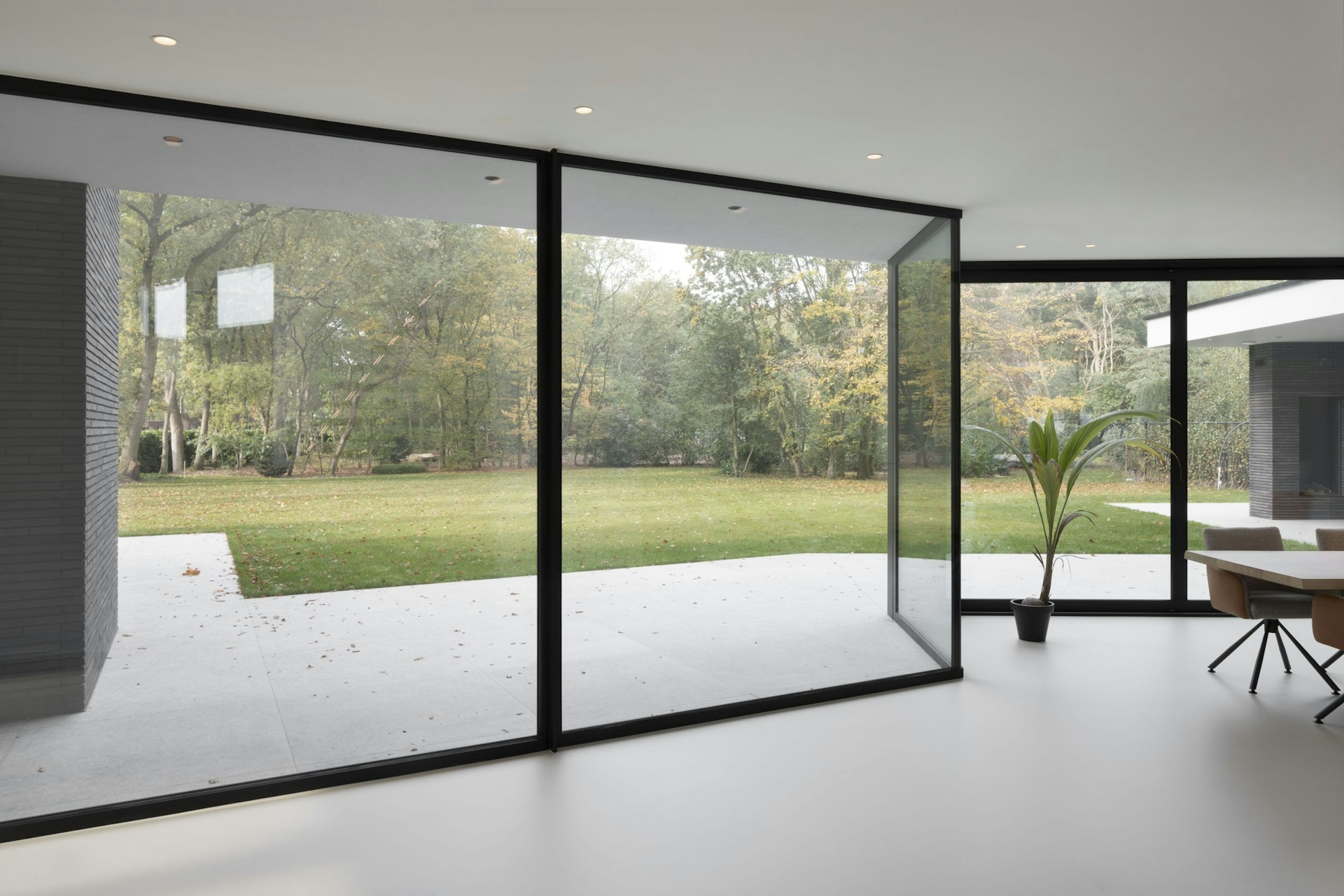
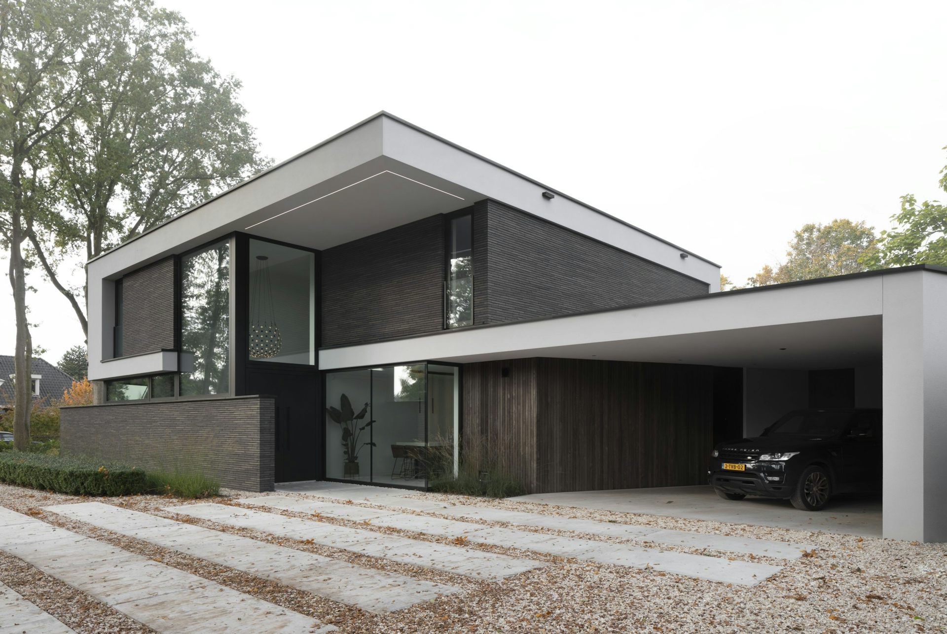
The design is also opened up literally at the rear façade, it being mostly transparent. This is in contrast with the other three façades, made mostly close with regards to privacy. This creates a sheltered feeling from the outside world; the road and neighbours. Yet, because of the almost fully transparent back façade, plenty of sunlight enters the building, creating an open feeling and a close connection to nature.

Double height
entrance
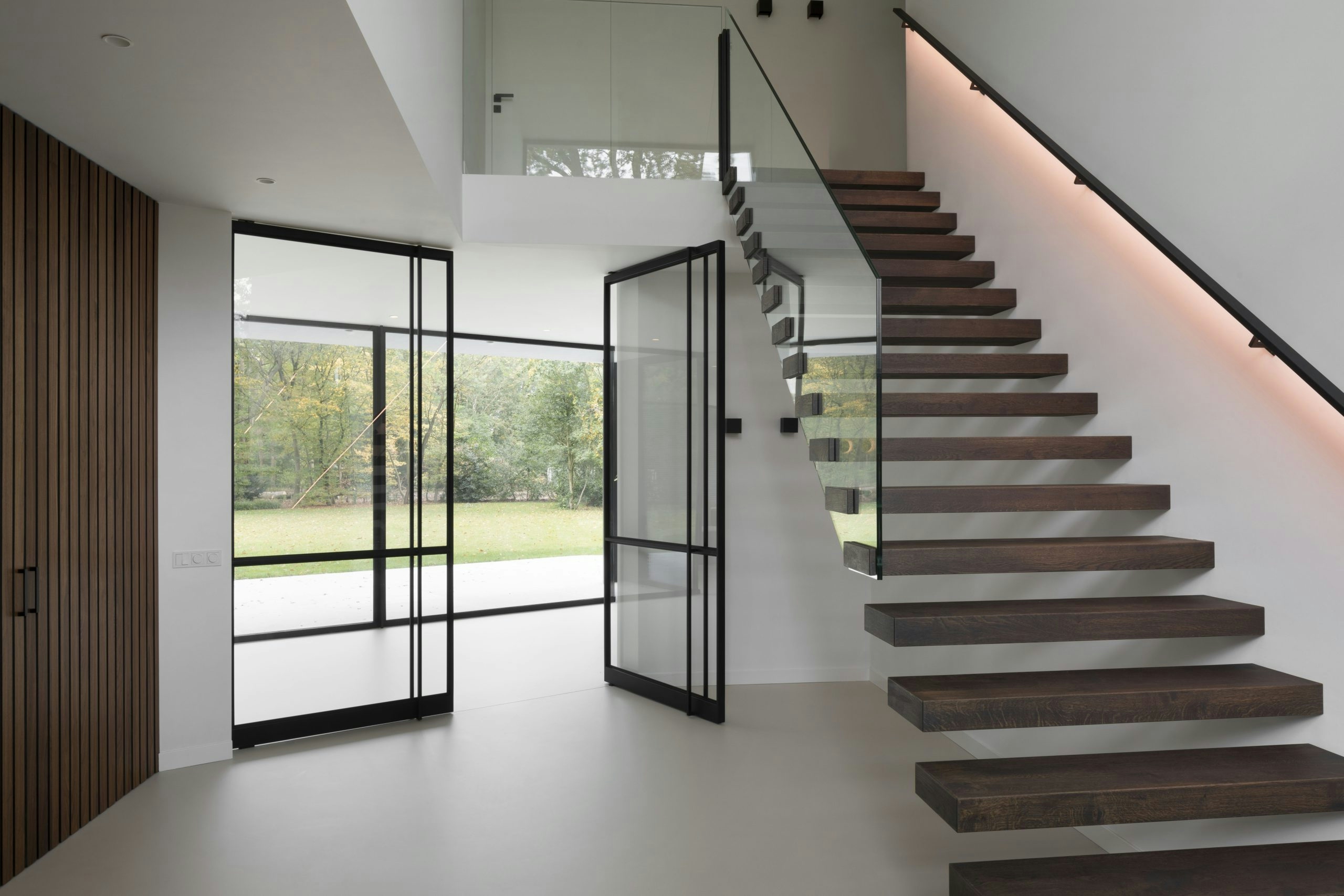
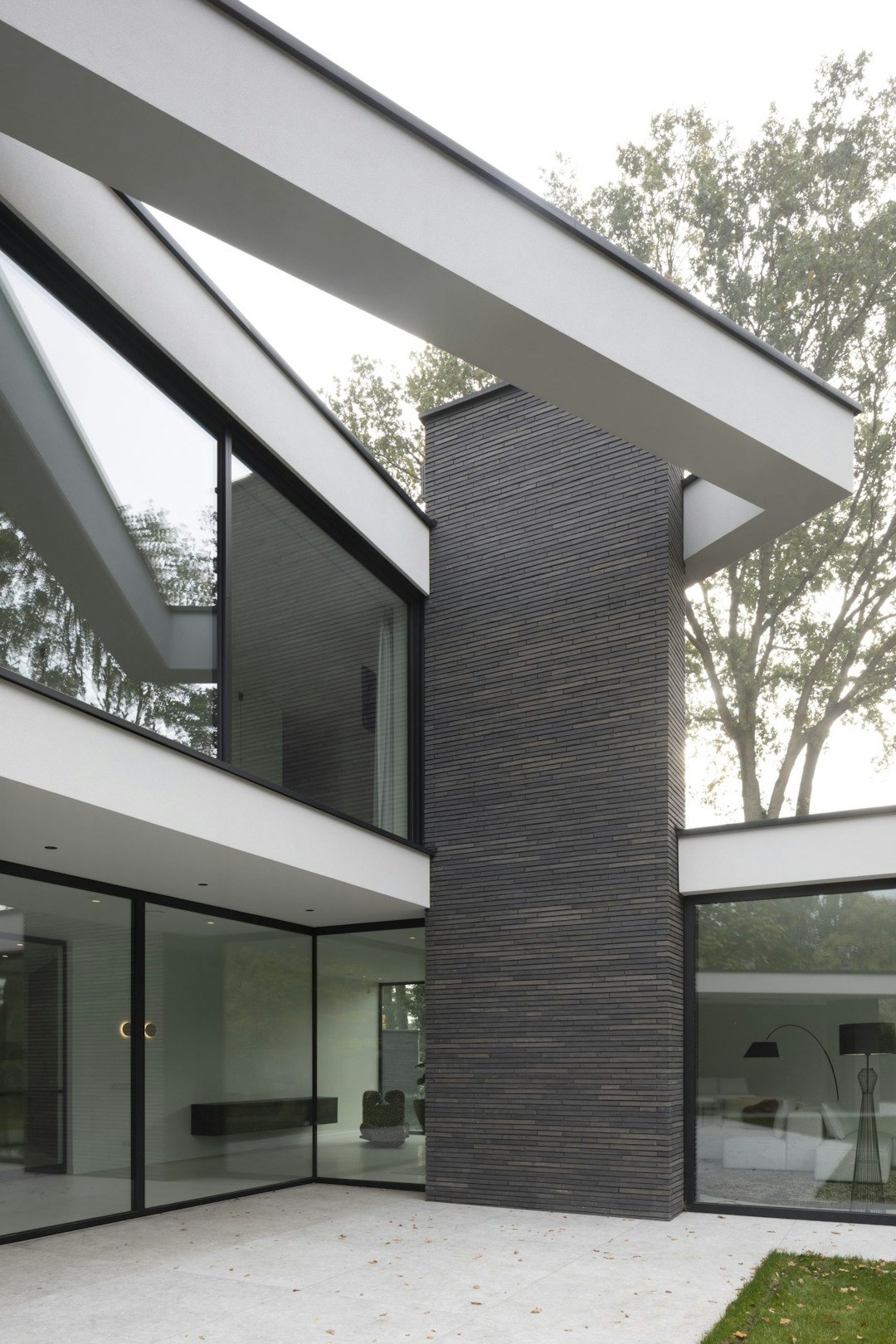
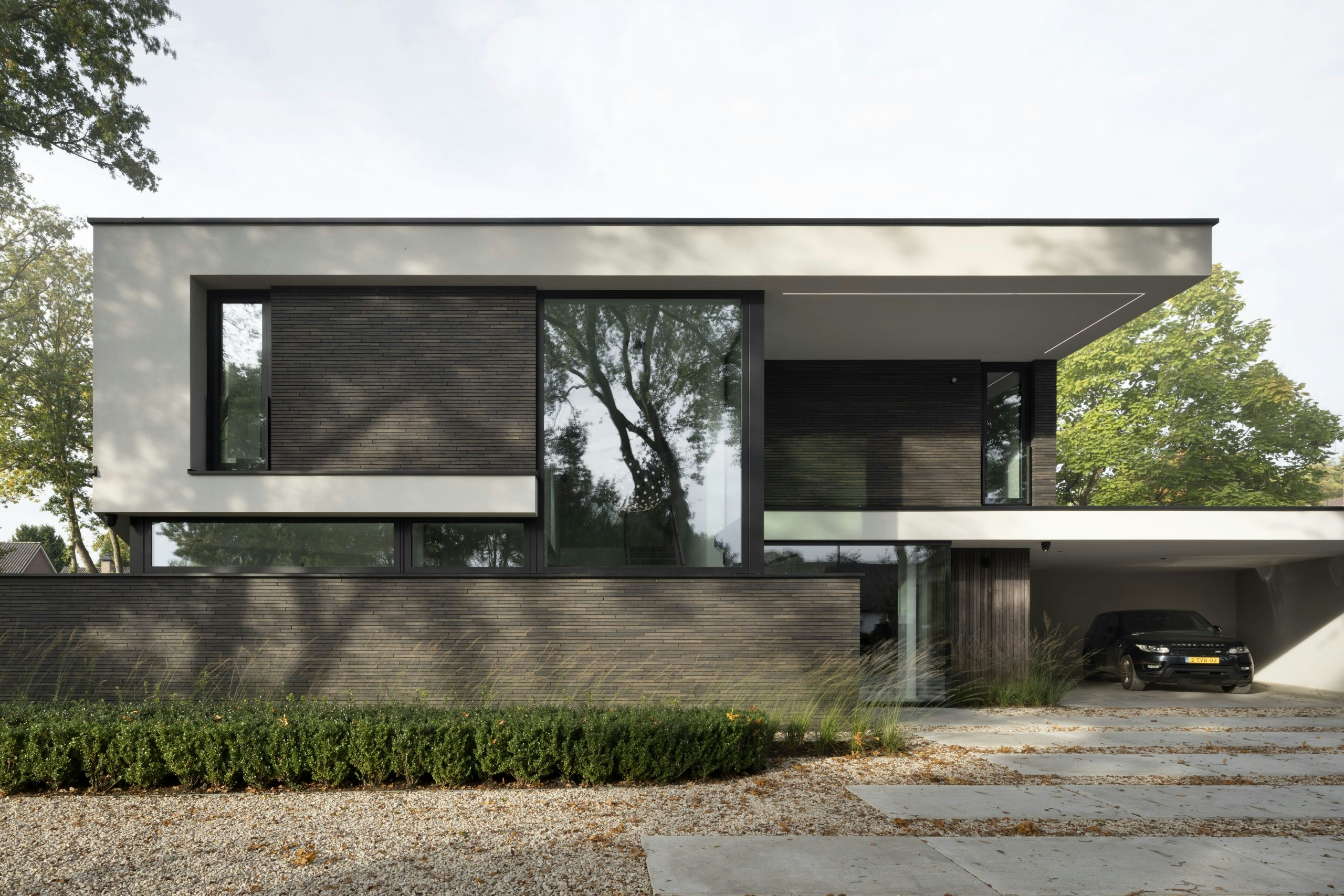
While the rear façade is almost entirely transparent, the front façade is mostly closed due to privacy. An exception is made for the entrance, as this doesn’t necessarily require privacy. A grand gesture is made with windows extending all the way to the roof. A large void behind this window creates an imposing scene when entering the building.
CONTOURS OF THE DESIGN
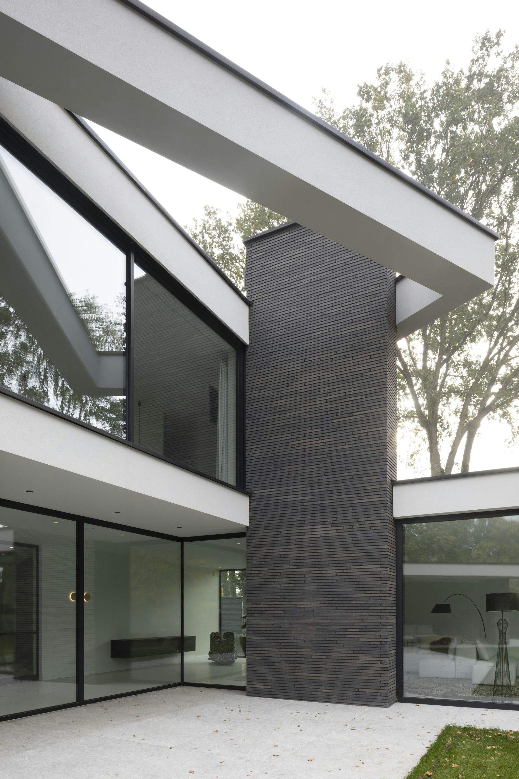
The open gesture is emphasized by the clean play of lines. Accentuating the floors with white stucco bands, the design gets a horizontal character. These lines are continued in exterior functions such as covered terraces for seating and dining. This way, the house feels grander, embracing the garden with open arms.
Key information
Project team
Geert Verschuren
Yvonne Willems
Rene Polderman
Collaborations
Used materials
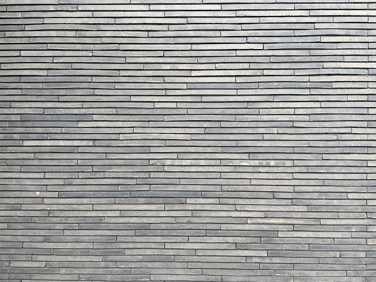
Enhance exclusivityThe main material used is a design brick called Petersen Tegl. These hand-made clay bricks have a unique horizontal shape, being 528mm long and just 37mm high, and are widely seen as the most exclusive design bricks. The horizontality of the building is emphasized by the horizontally oriented Petersen bricks.
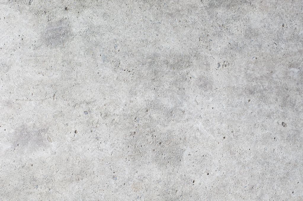
The bricks are accompanied by supporting materials such as polished concrete and white stucco. These materials are clean and don’t have much texture. This is done deliberately, to prevent multiple busy materials from fighting for attention. Now, the materials create a balanced composition, supporting each other, rather than opposing on another.
TEGL
concrete



Concept diagram
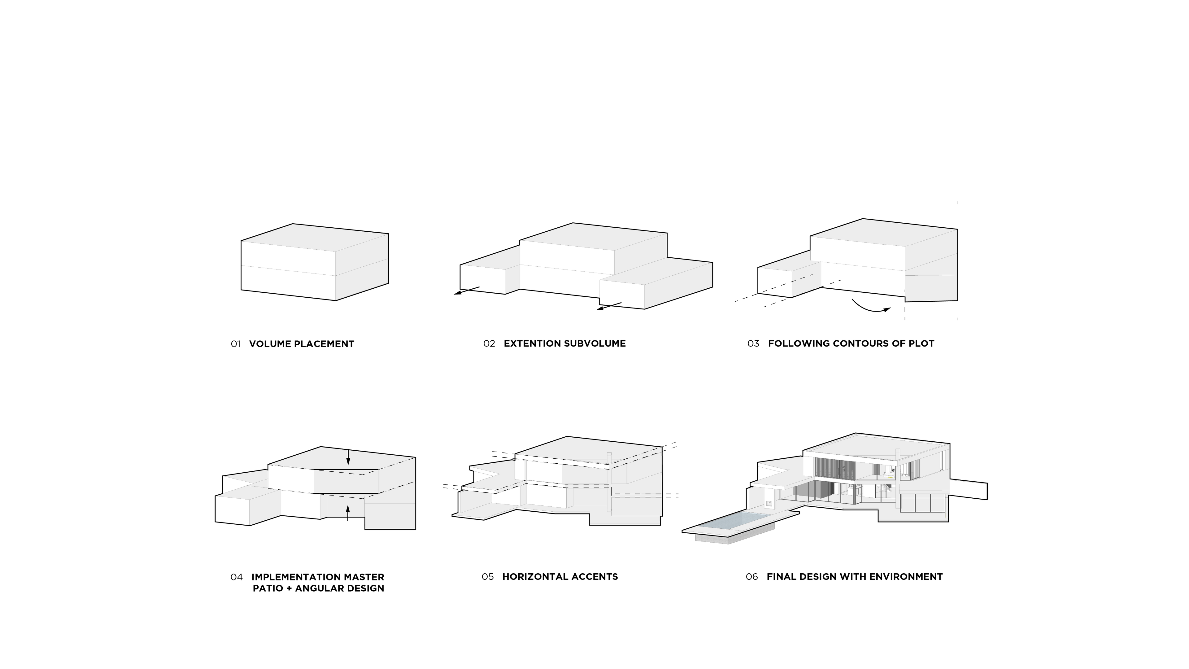
The design originates from one main volume with two sub-volumes on either side. These sub-volumes are subsequently angled towards the contours of the plot, opening up the design and creating a certain harmony. The floors are accentuated by horizontal lines, making the design feel even more open.
GROUND FLOOR
Download brochureFIRST FLOOR
Download brochure
Ready to celebrate
your succes?
Ready to celebrate your succes?
We love to collaborate with
ambitious clients. Let’s connect!
Say hello@stateofarchitecture.com
