Yin Yang
house
Yin Yanghouse
Project informationPERIOD
2021-2022TYPE
RESIDENTIAL, VILLALOCATION
THE NETHERLANDSSIZE
800m2STATUS
IN PROGRESS
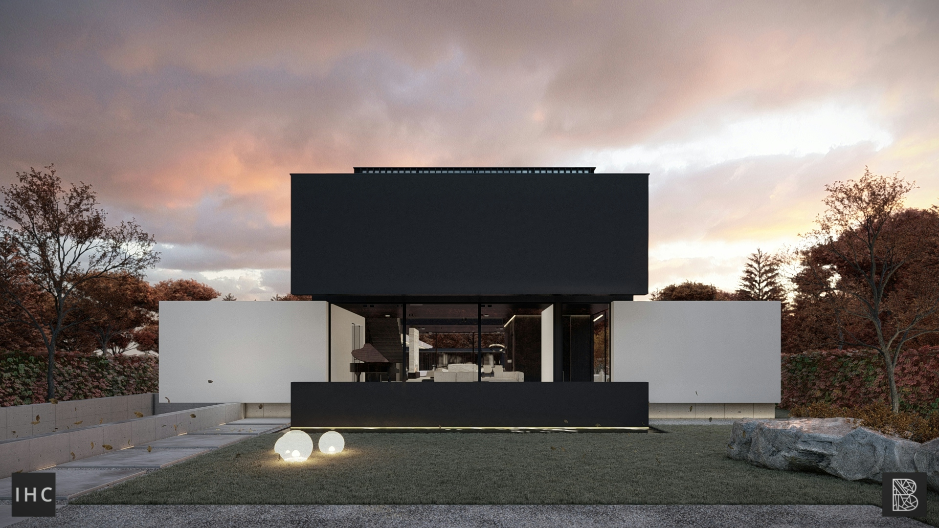
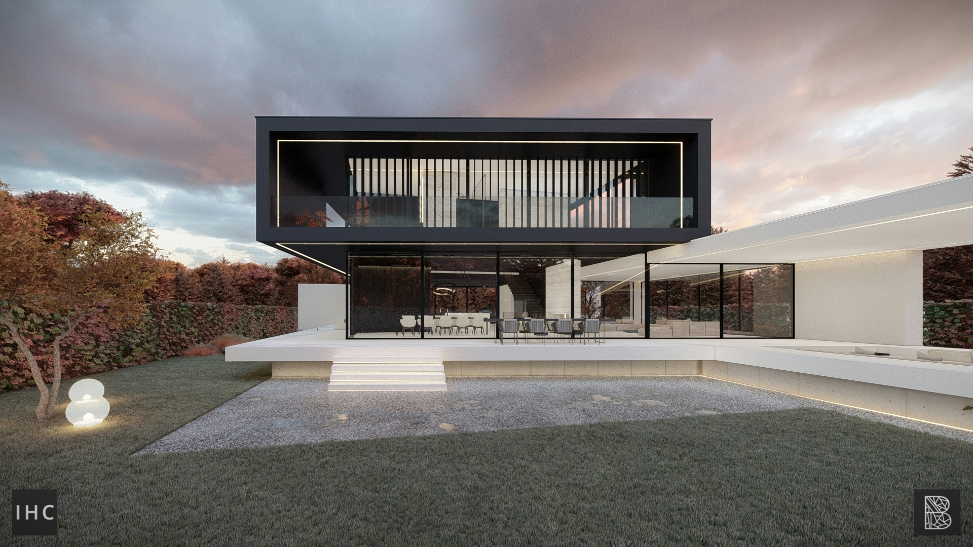
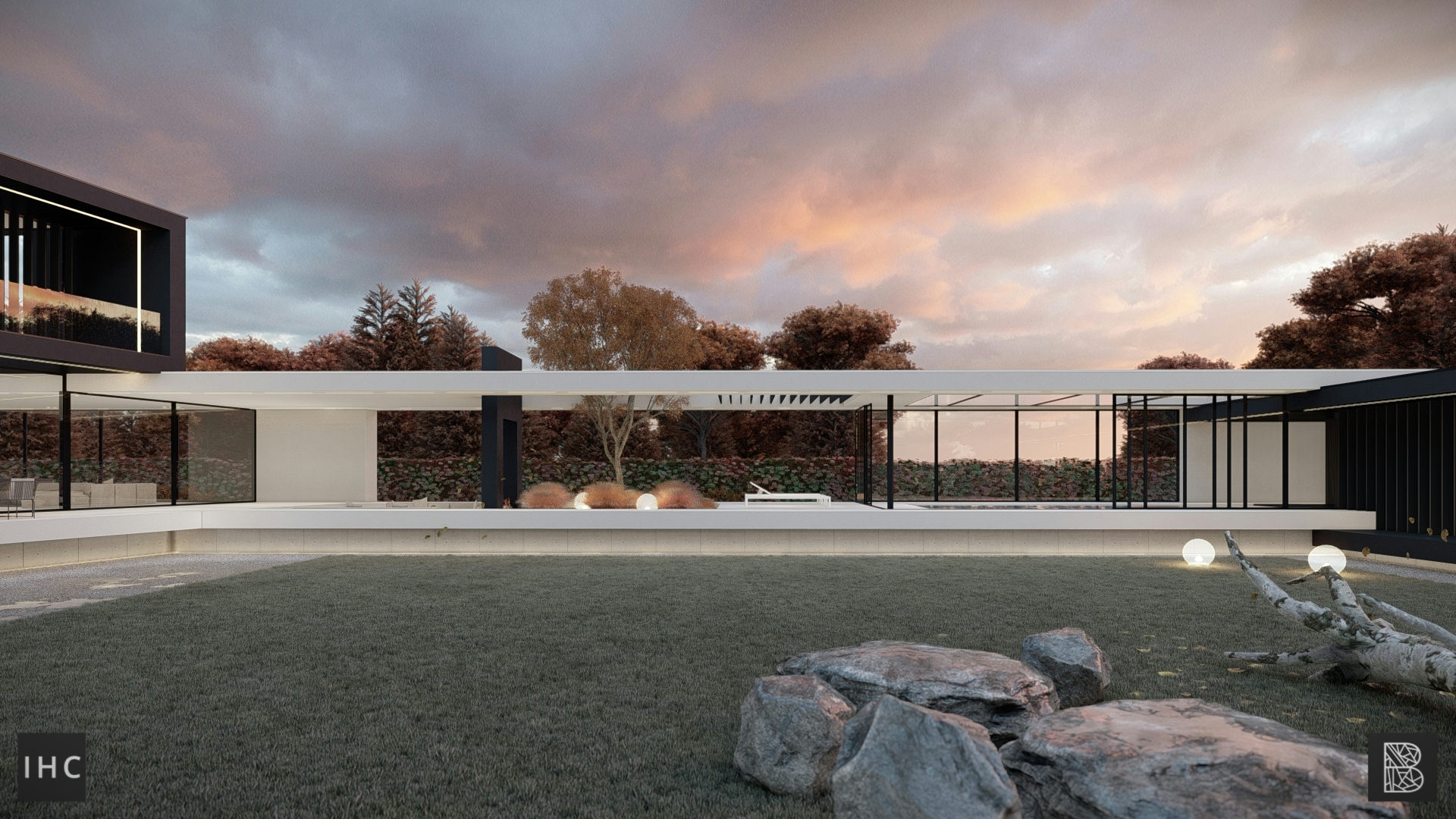
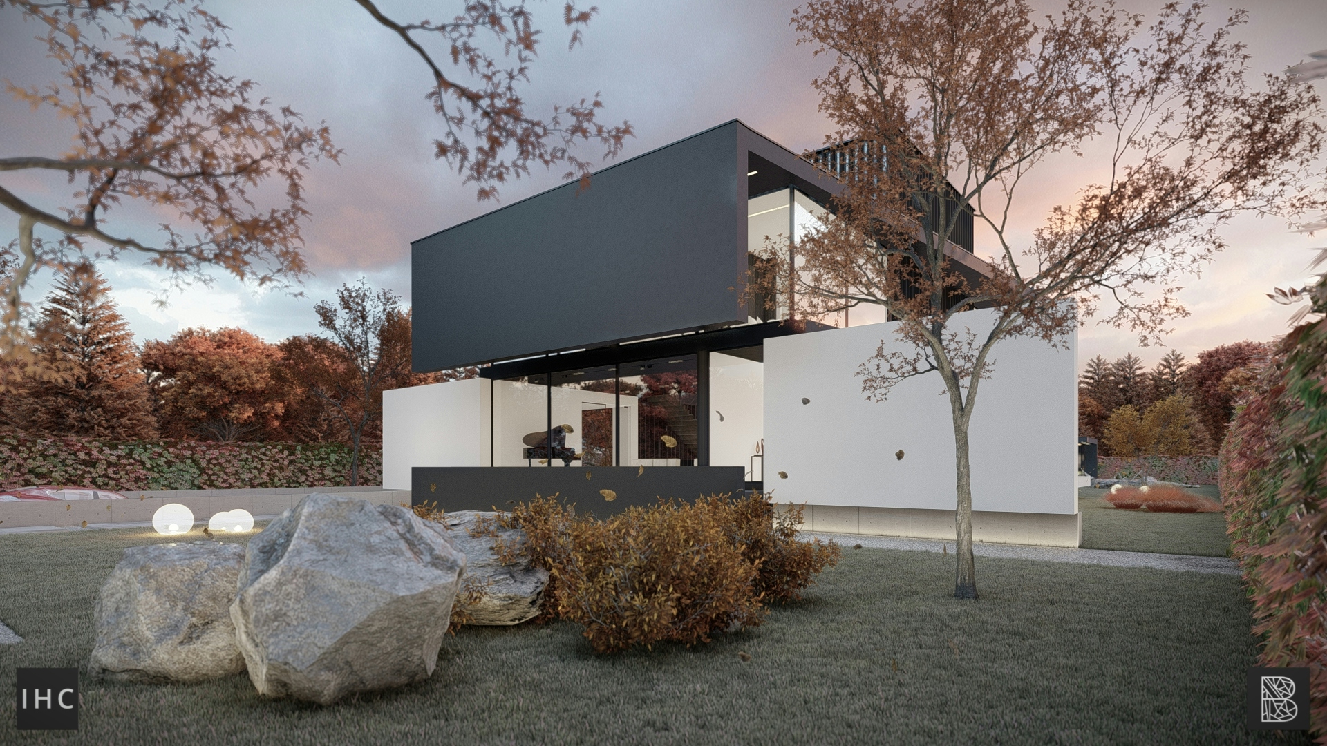
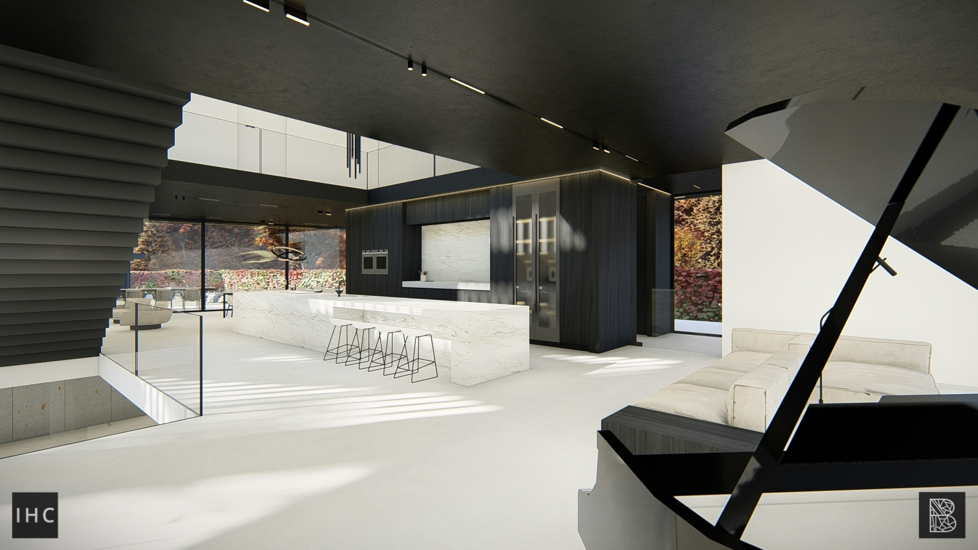
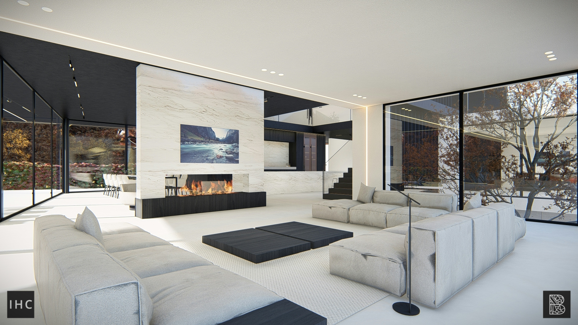
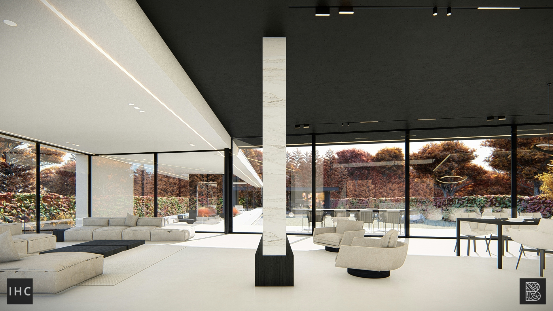
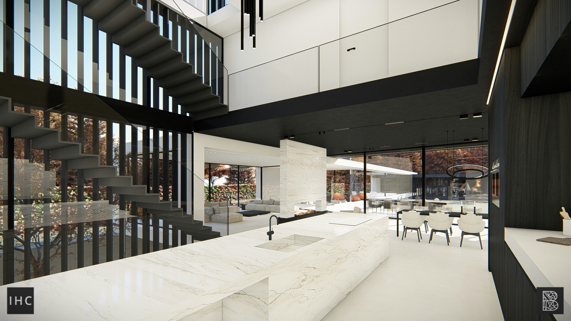
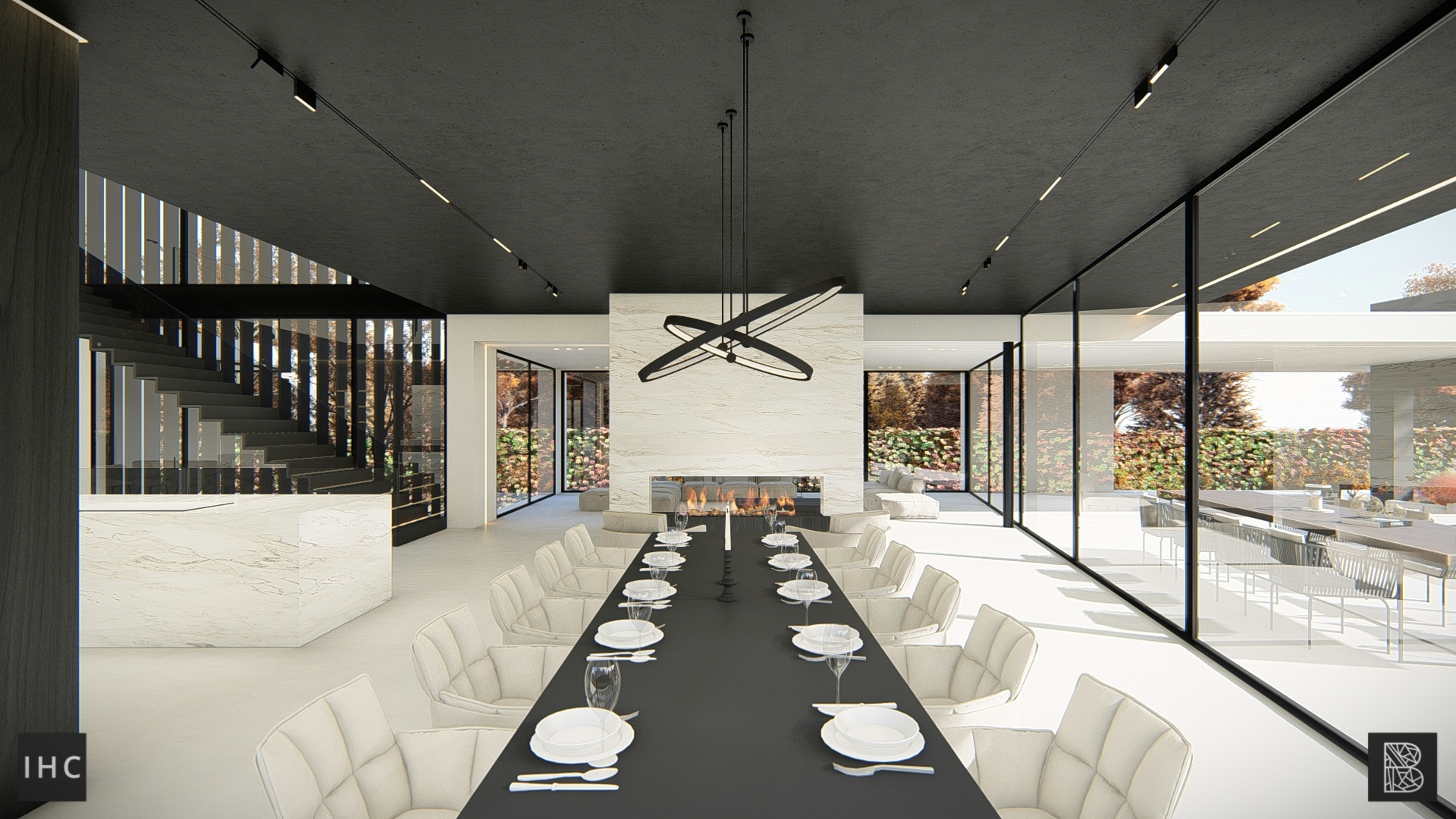
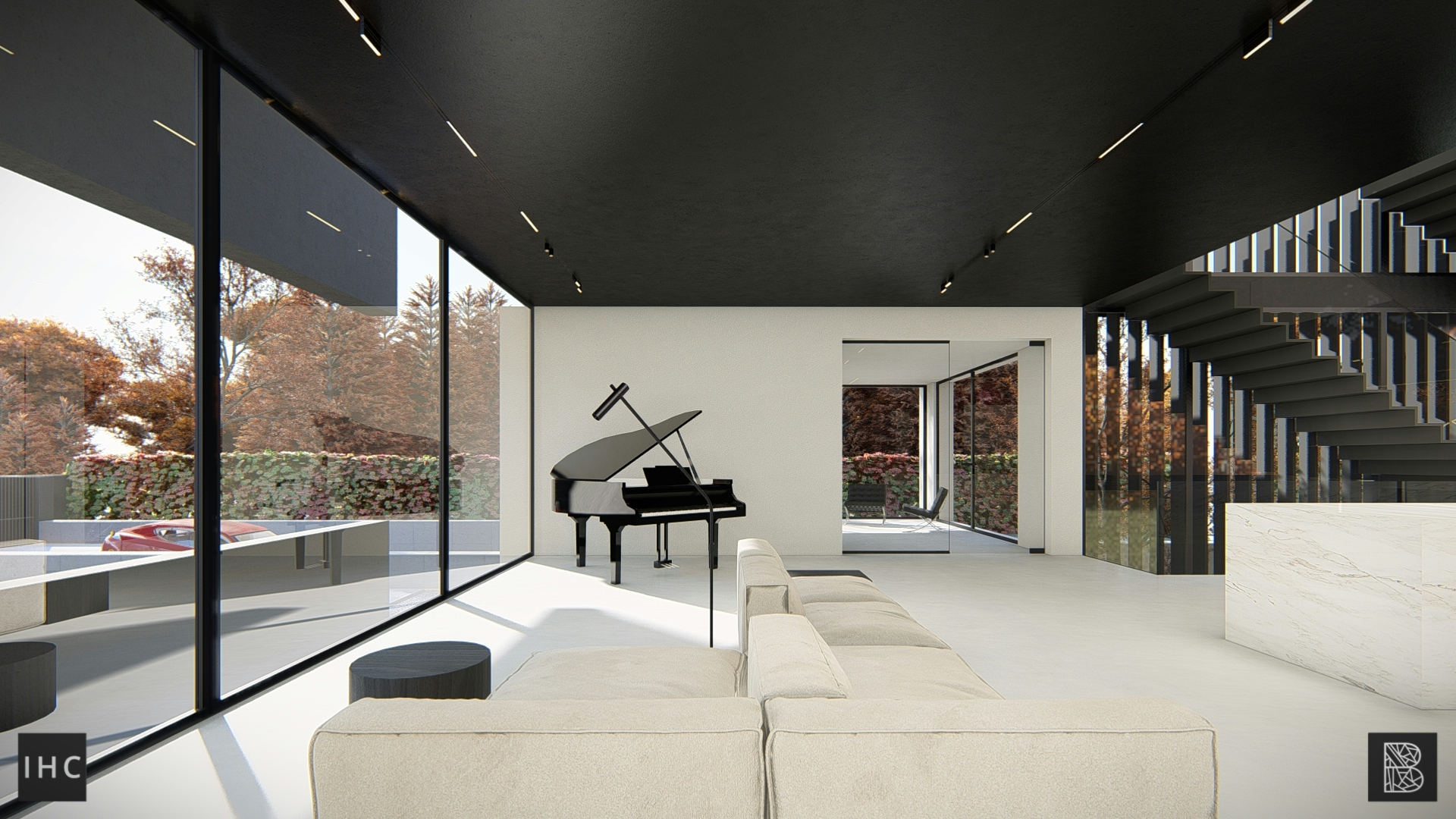
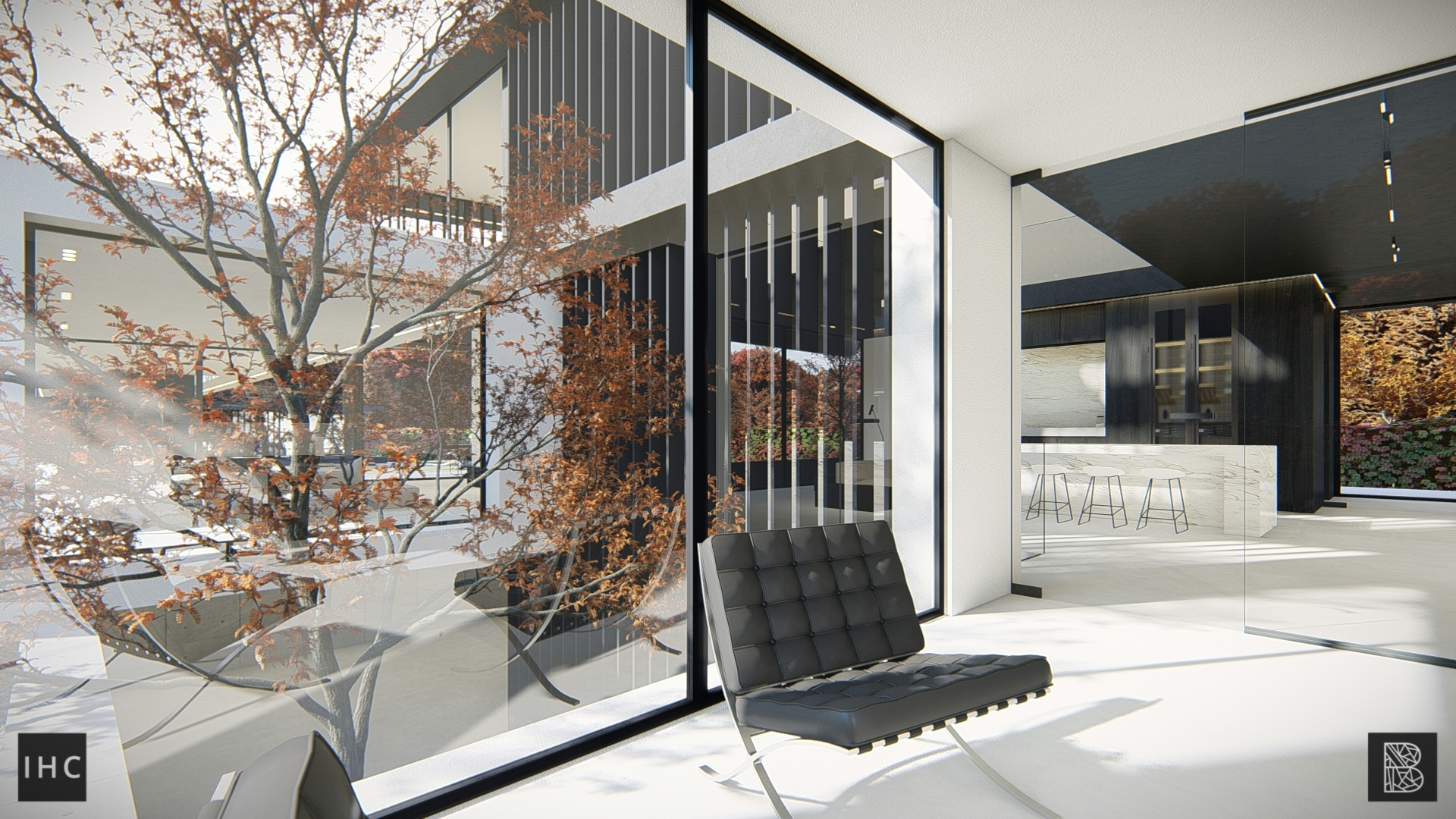
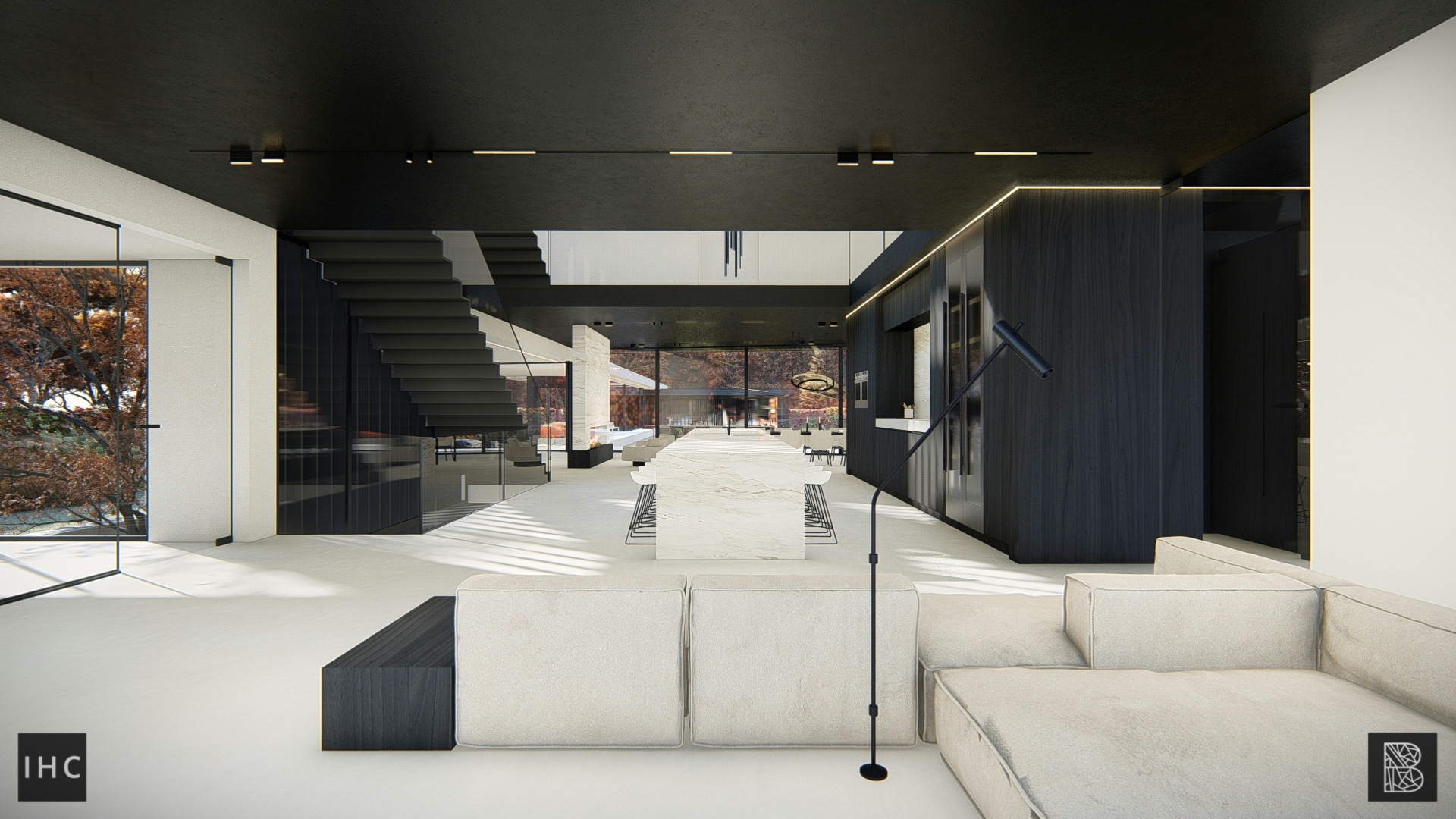
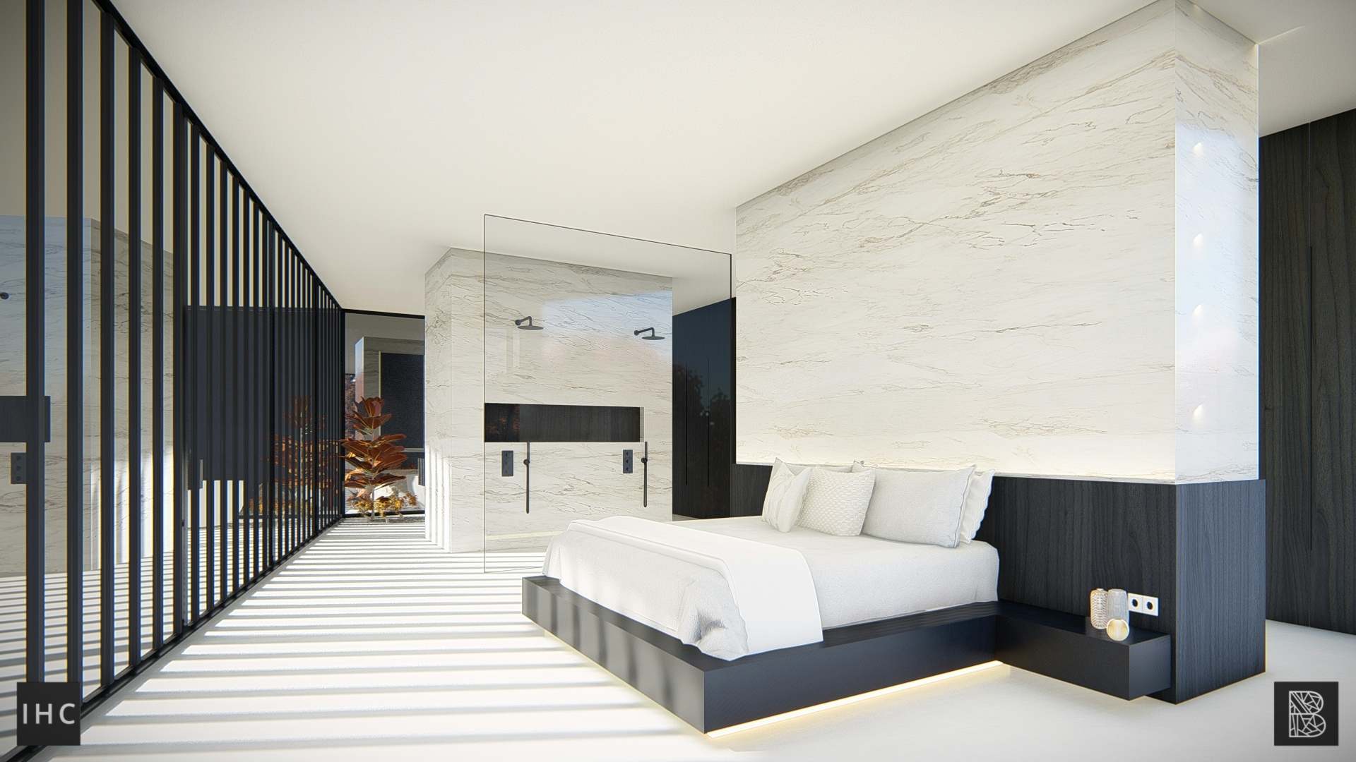
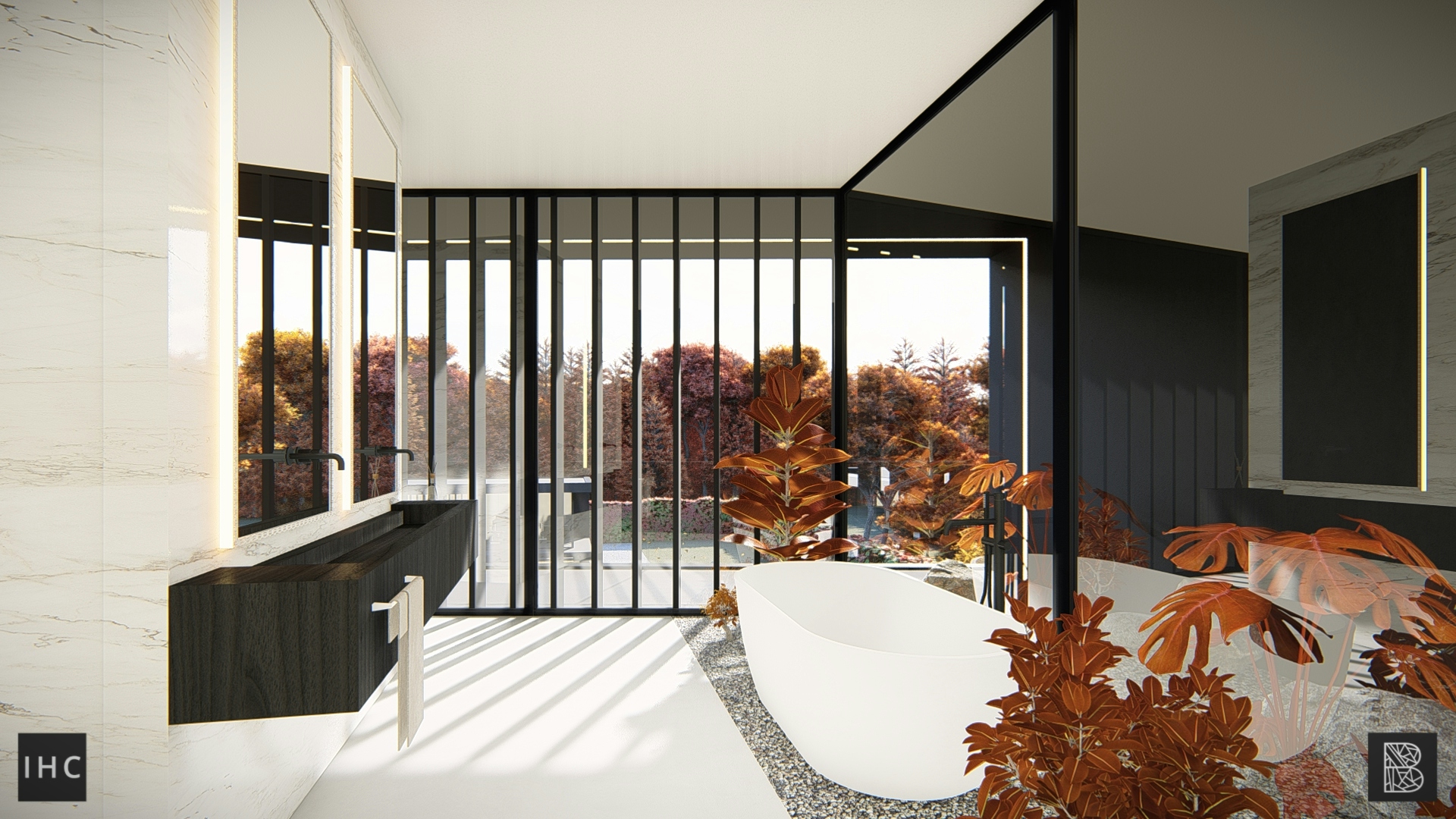
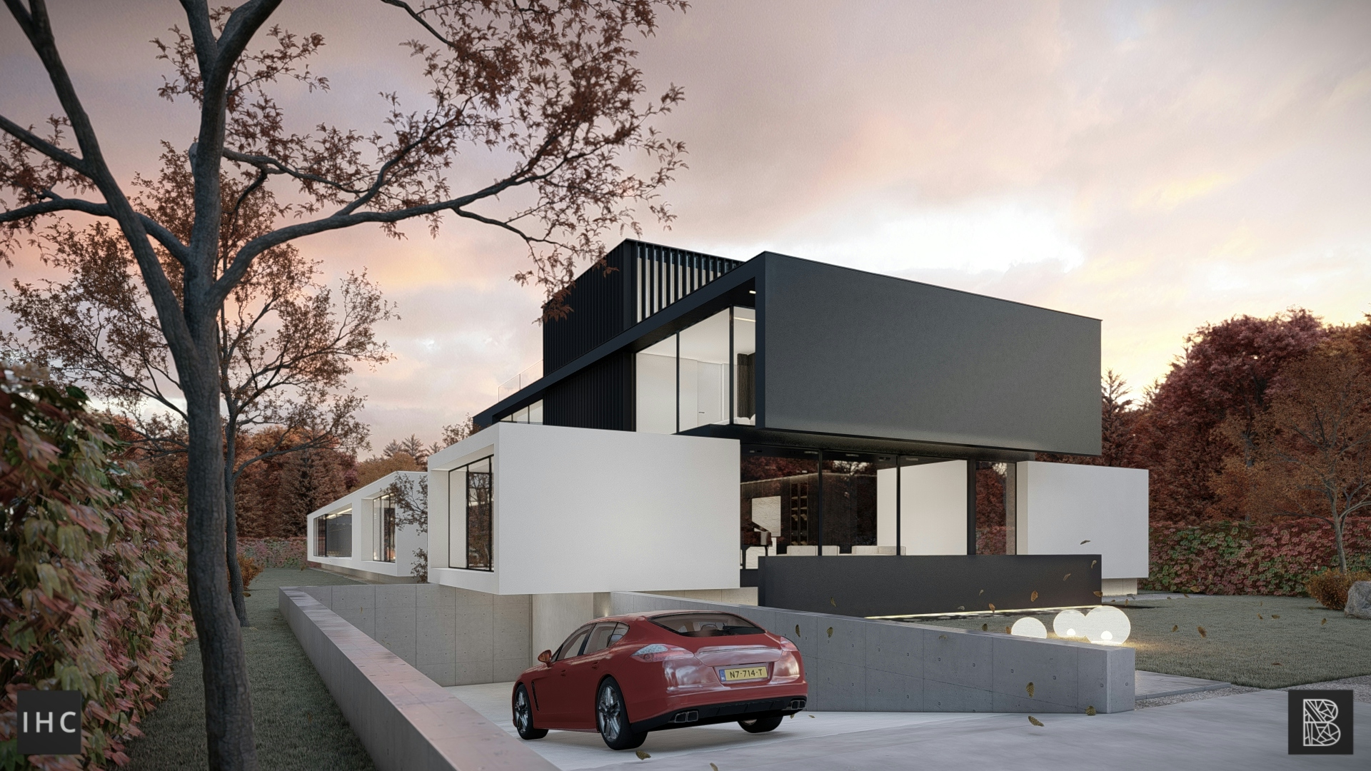
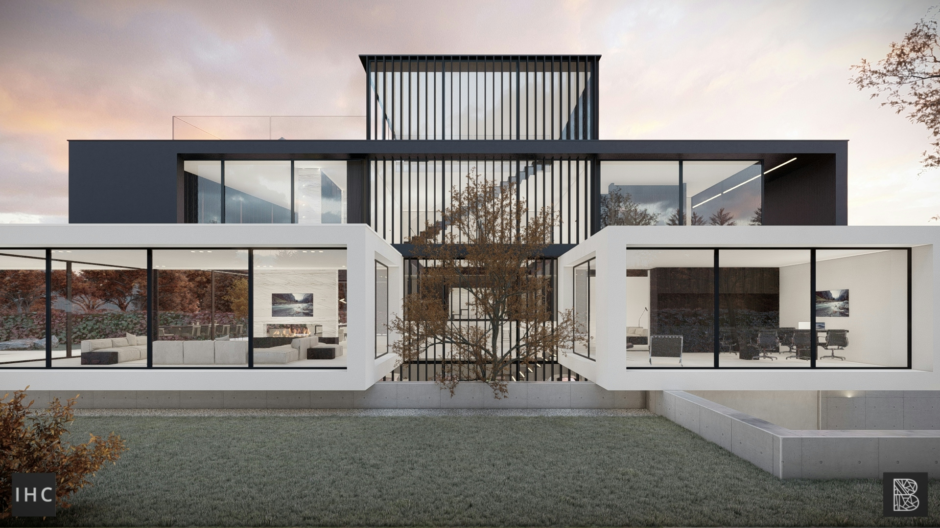
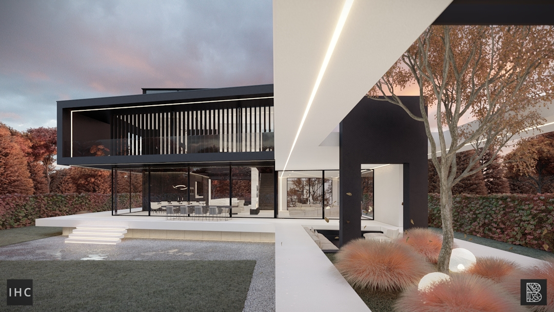
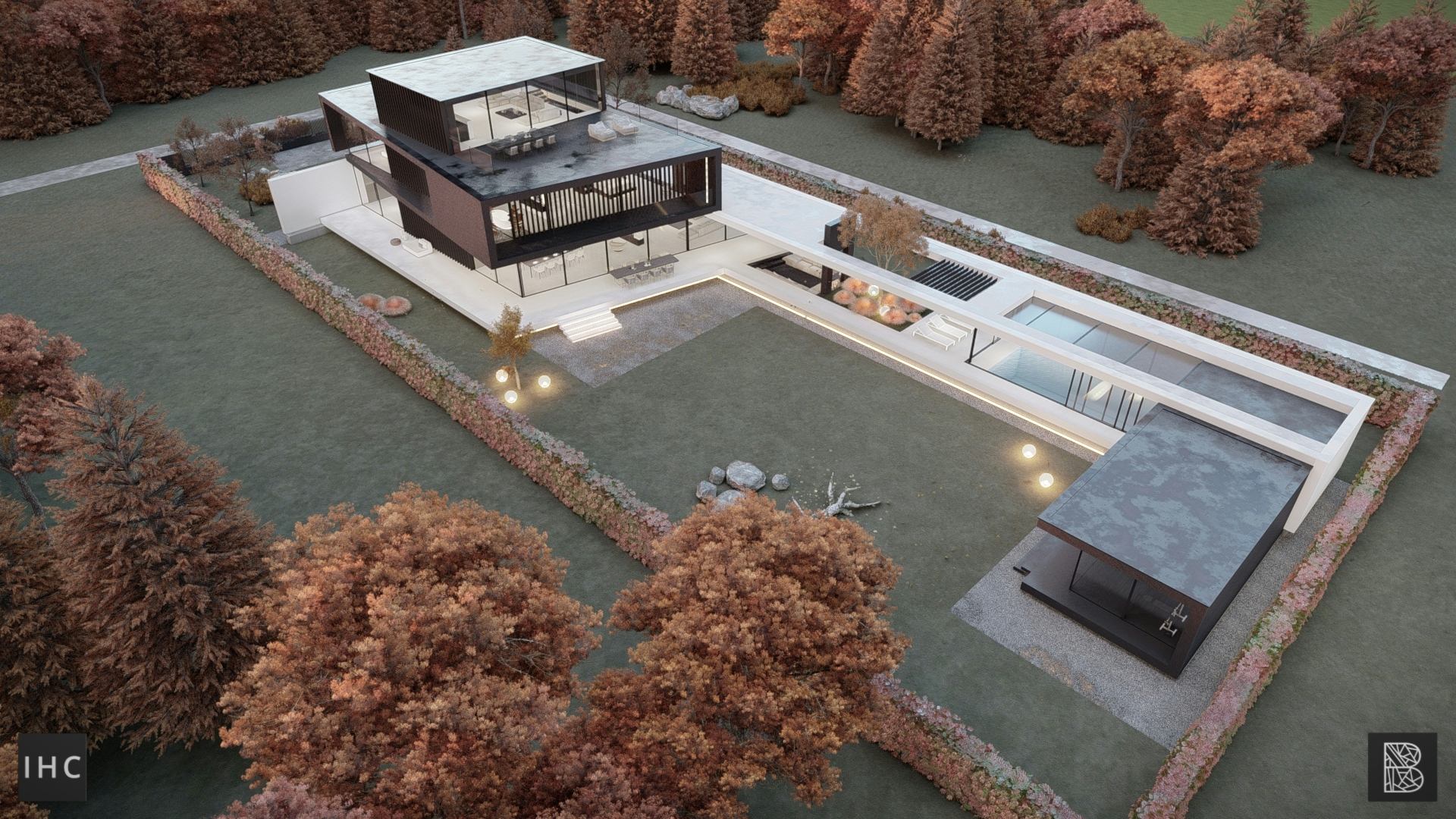
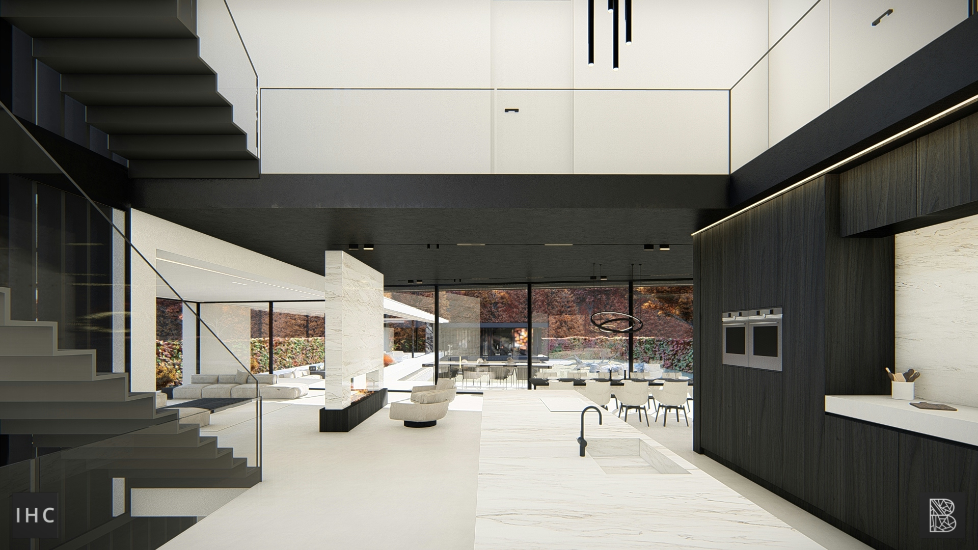
Yin Yang House is an exquisite example of harmonized contrast. Black and white, two opposite forces, are used to create a balanced and interconnected composition. If one falls away, the harmony is broken. White lines continue in black volumes and vice versa, supporting each other structurally and aesthetically.
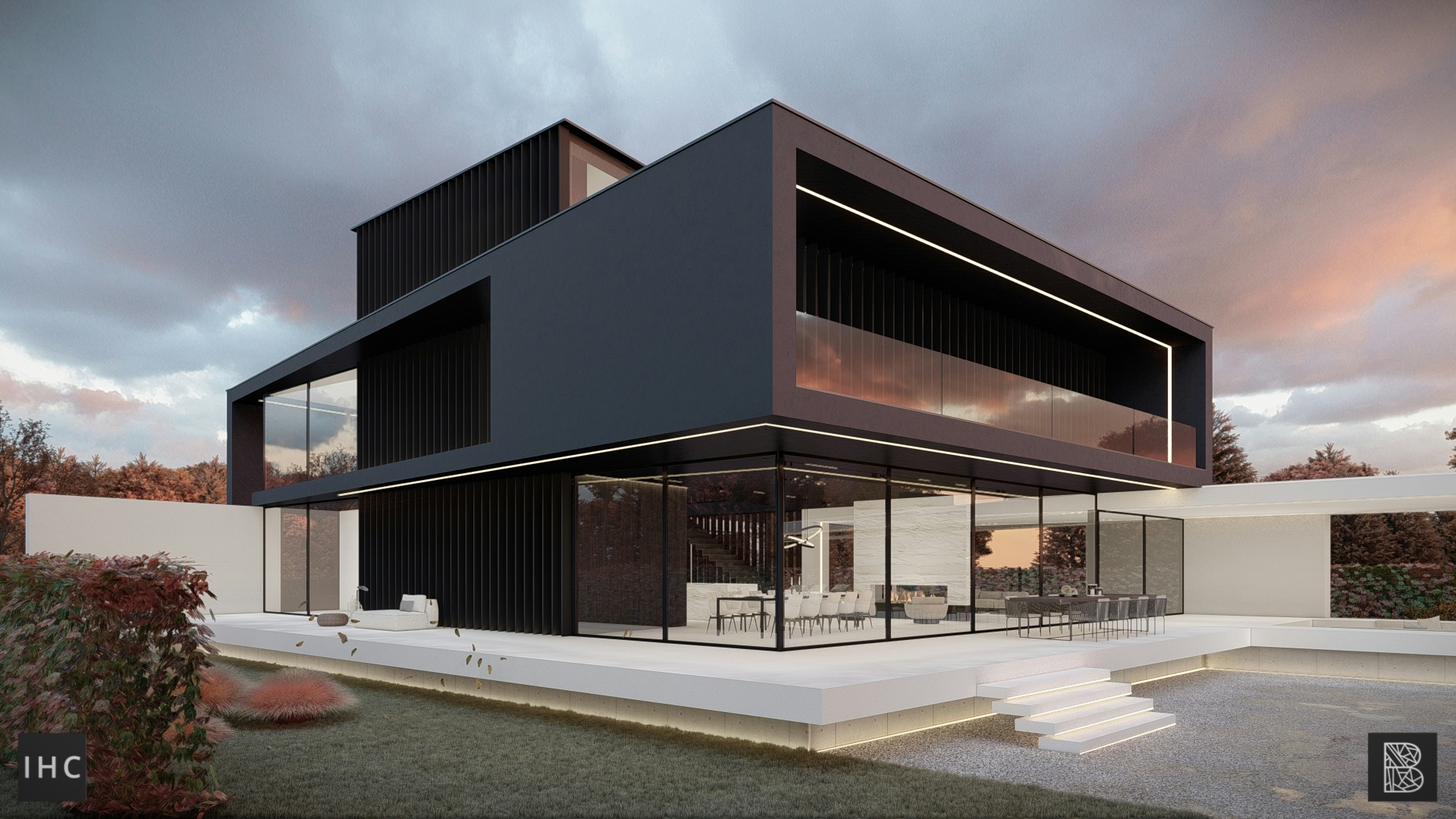
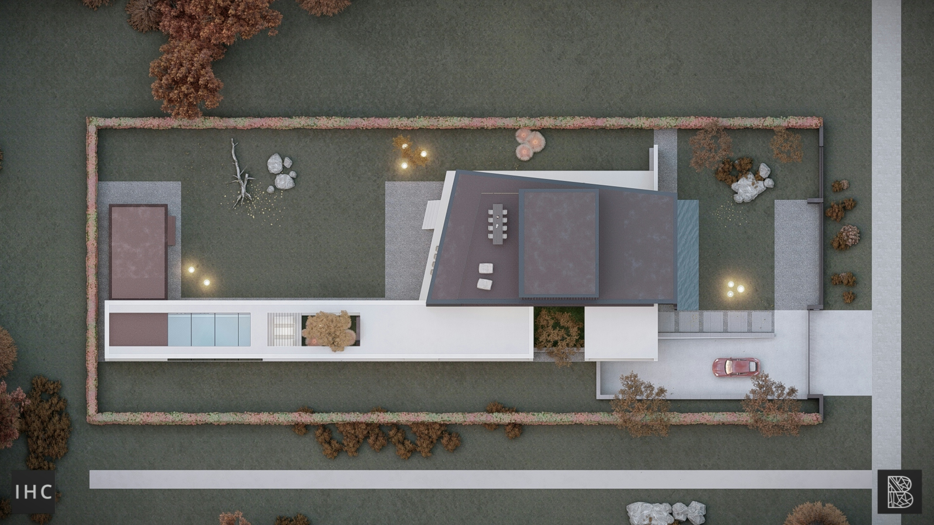
The front façade may show this harmonized contrast to the fullest. A white, horizontal volume and a black vertical volume intersect. Both volumes are completely closed, except at the point of impact. Here, where both volumes intercept, they are opened up. Black and white are cut through by light. The glass façade emphasises the point of impact and is the only opening in the entire front façade.

BALANCED COMPOSITION
THROUGH COLOUR
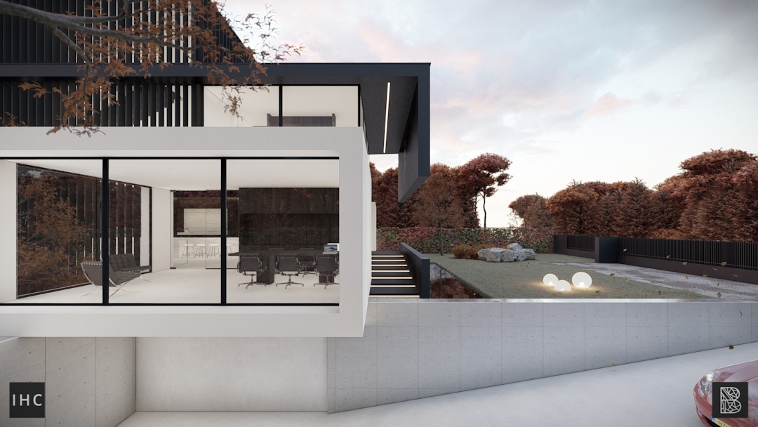
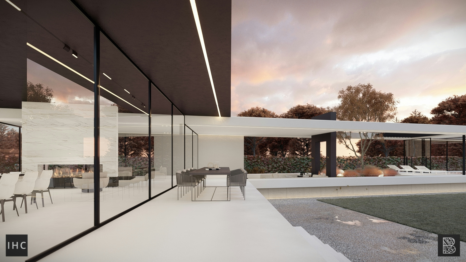
The master bedroom balcony hangs over the ground level, creating a covered terrace. The black volume feels heavy, but by strategically placing the columns, the structure isn’t visible. The volume almost seems to float, only supported by one white line.
OUTSPOKEN AND LUXURIOUS
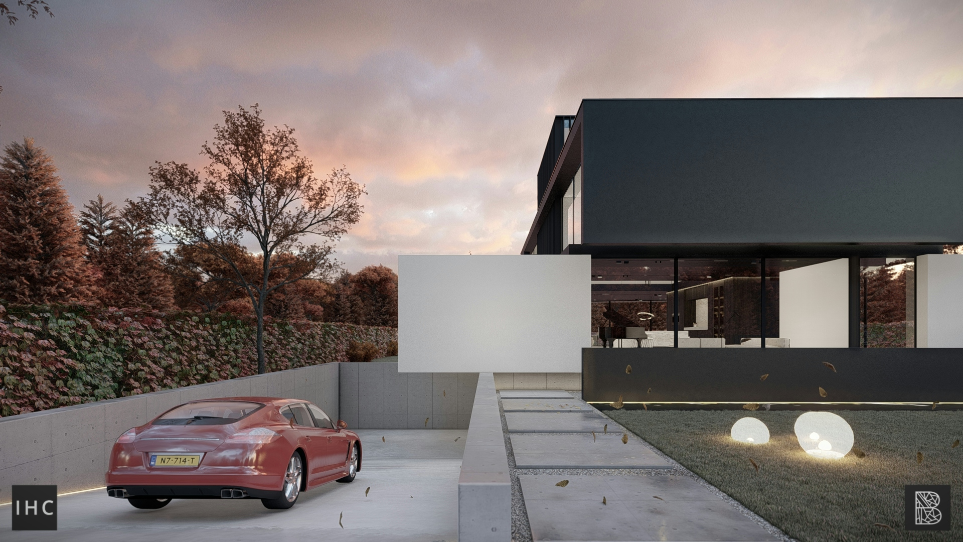
Privacy and luxuryYin Yang House makes a clear statement. It stands out from its surroundings; it is outspoken and unique. The front façade seems to be closed, creating privacy, but because the black volume is extended further, it overhangs the entrance. This creates a 9-meter high exterior void, sheltering from rain by the vertical wall.
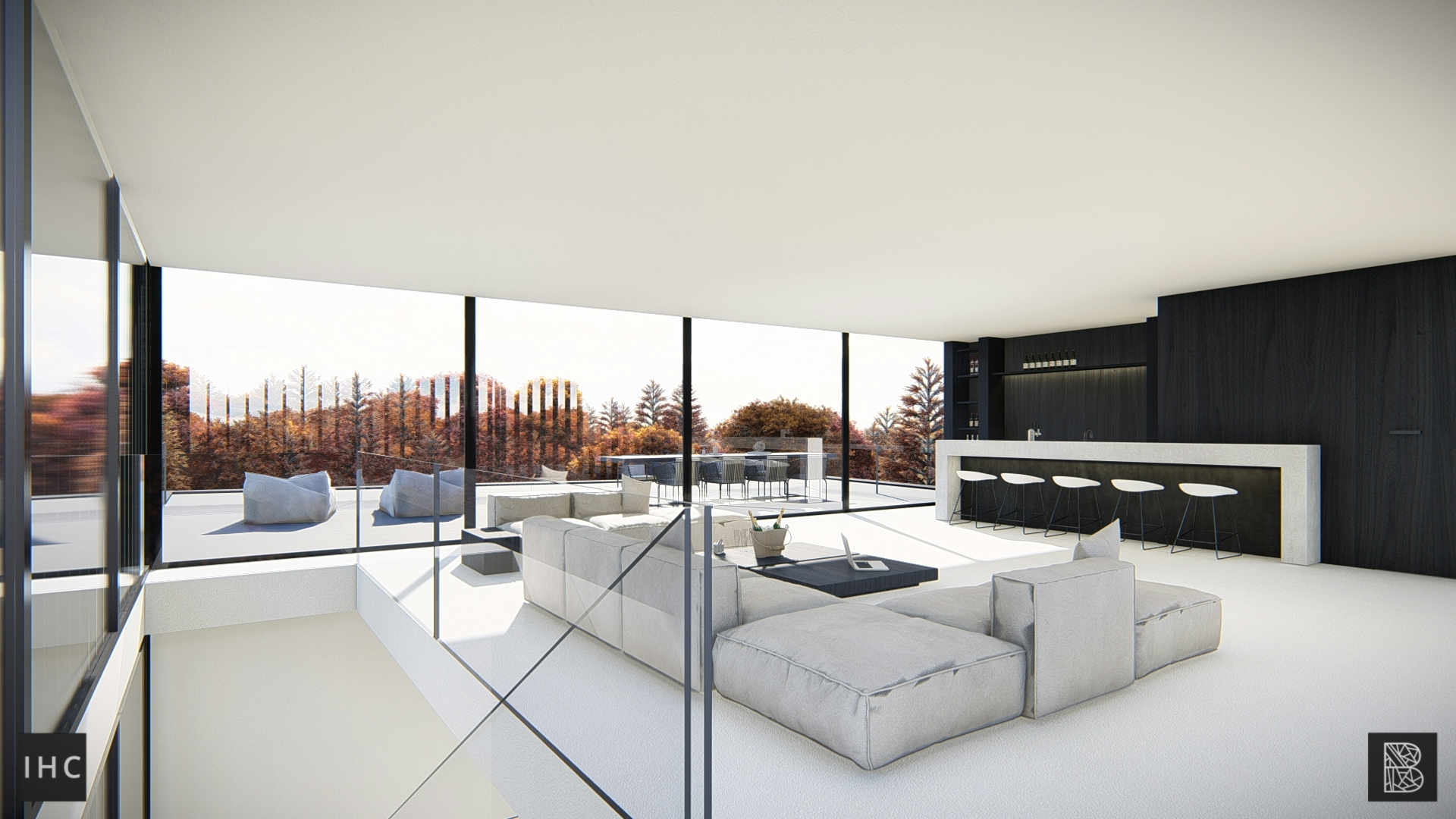
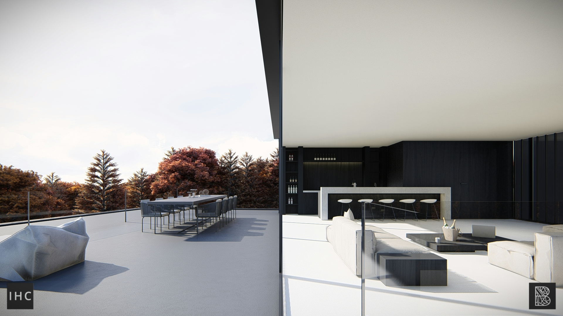
This vertical wall also gives privacy while the bedrooms behind it get plenty of natural daylight through the glass façade. Transparency and opacity create a secondary contrast. Luxurious glass façades and privacy through outspoken architecture harmonize in one composition.
Used materials
ContrastingMaterial
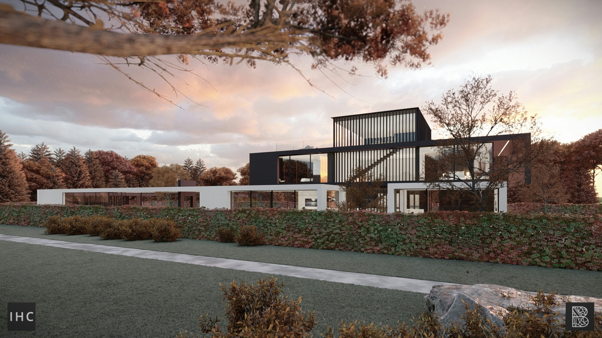
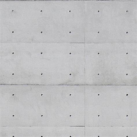
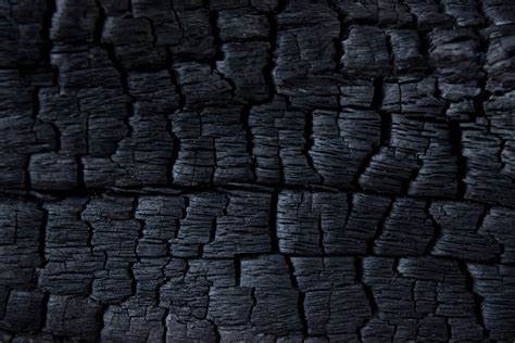
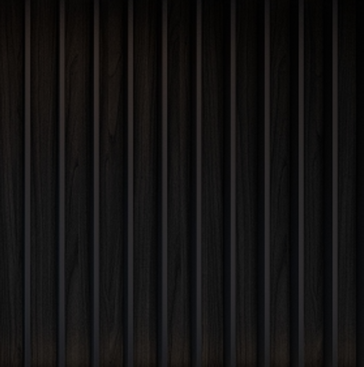
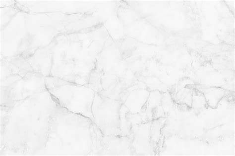
Yin Yang may come forward most in the materialization. Black and white stucco are the most commonly used materials, being the cleanest way to represent one colour, without texture. The entire building is raised 1 meter from site level, showing the concrete foundation, an instinctively sturdy material. But by pushing back this concrete foundation, the entire building seems to float above the plot. This is emphasized by the LED lighting, creating the illusion of hovering.


Verticality and
horizontality collide
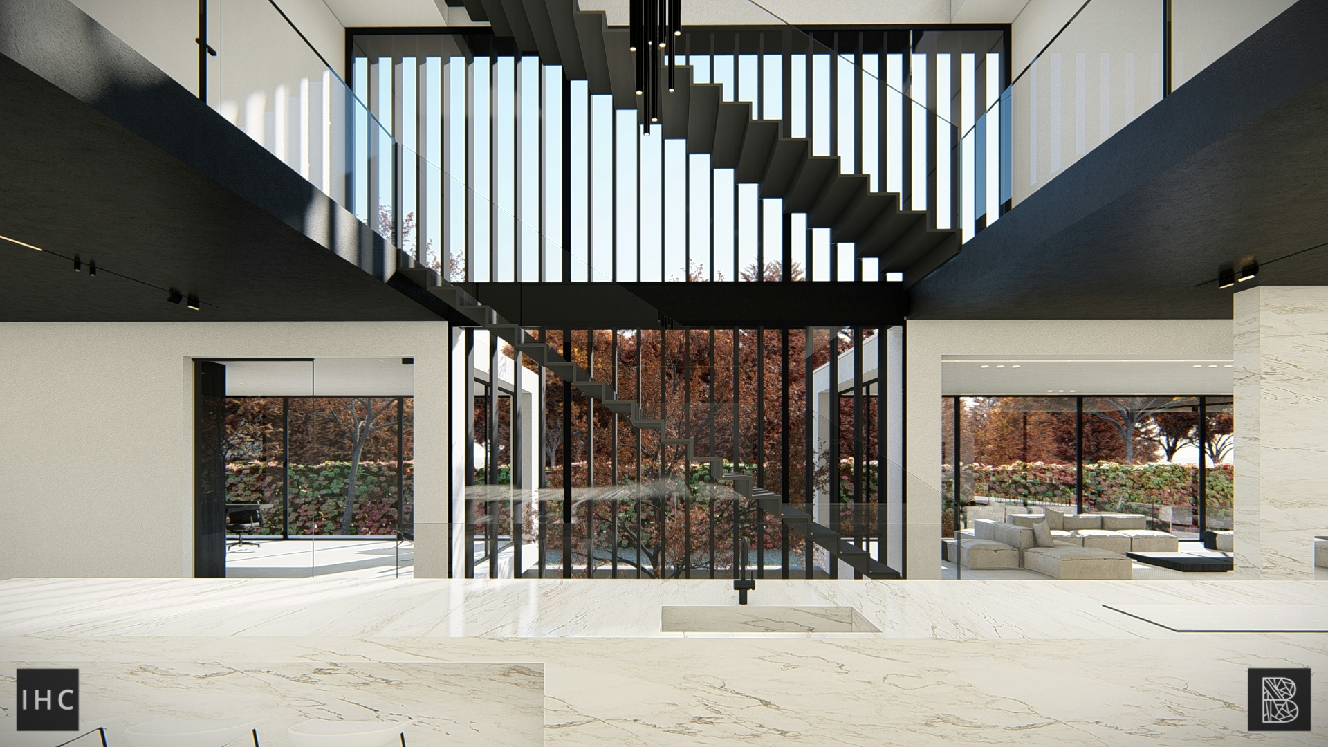
Vertical aluminium blinds accentuate the four-story vertical volume, which connects every level. The highlighted verticality juxtaposes the horizontality of the building, creating contrast and a point of interest.
Indoor or outdoor pool?
why not both
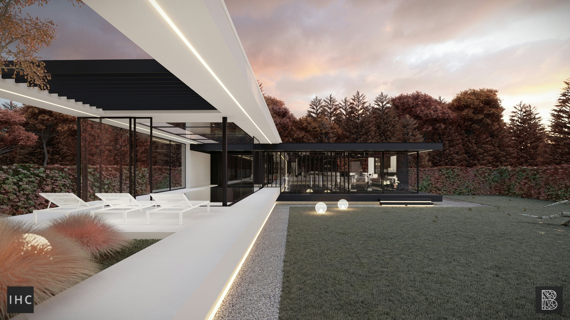
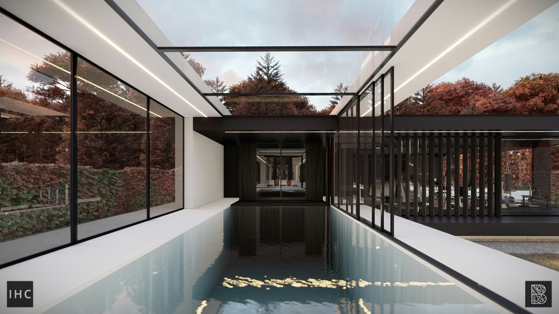
Blending spaces is most apparent in the interior swimming pool. The pool is completely enclosed by glass facades and the large skylight gives the room an even more open feeling. The two glass façades facing the garden can also be opened up completely, making the line between indoor-outdoor disappear.
Ready to make
your statement?
We love to collaborate with
ambitious clients. Let’s connect
hello@stateofarchitecture.com

